Our clients come to us for a variety of reasons, as they seek custom design solutions to build their brand, differentiate their organization from the competition, and propel positive change. And while the resulting design may be the most visual, obvious result of our work, our relationships with our clients and our process of discovery begin long before we ever get to that point.
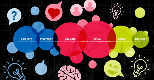
This quarter, we’re taking a deeper dive into some of our team’s most memorable projects, illustrating how personal connections with our clients’ missions can mean the difference between good and great design; seeing how some of the newest trends in design can guide decision-making; and showcasing work that we’re particularly proud of this year. Join us on this journey from discovery through implementation – and know that whether the challenge is for print, motion, logos, infographics, websites, meetings, or a full campaign, we approach every project with the same passion for making an impact.
PN Newspaper – Giving Back through a Publication Redesign
Christina Davies, Art Director and Brand Strategist
When the American Psychiatric Association came to us to revamp their long-running publication, the Psychiatric News (PN), I knew it was going to be a special project. Print projects – especially large-format newspapers – are becoming much less common yet allow us the opportunity to design within such a unique format. And, schizophrenia and other mental disorders run in my family, so I’ve personally seen the difference that proper treatment can make in someone’s quality of life. Having this chance to give back to a profession that has helped my own kin made this an important project to get right.
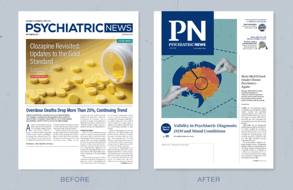
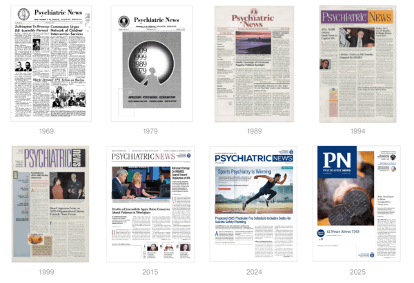
Before we even considered the direction a new design might take, we conducted extensive research into the publication’s history. The journal has been produced since 1969, and every issue is archived on PN’s website. That gave us a wealth of visual history to pull from, and it gave me a personal appreciation of how design so clearly evolved through each decade. Now our work gets to be part of that history.
When designing the new template, we had to consider the digital component of the piece – abbreviating the journal nameplate to PN was not just a stylistic choice, for example; it was a practical decision that would translate to the age of social media. The decision to incorporate serif fonts was also based on the current shift we’re seeing in design away from the clean, minimal sans serif fonts to the more personality-driven fonts and an appreciation for classical text. Serifs evoke a sense of history, knowledge, and integrity, which felt so appropriate for a legacy publication. We chose a serif that would recognize the body of work and research that came before while retaining the overall feeling of airy and modern design.
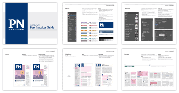
We also took care to make sure the template we designed was easy to use and flexible: Creating a monthly publication is a massive undertaking, and I take pride in knowing we helped create something that will aid not only the professionals reading it in their practice, but will also make it easier for the people behind the scenes who are disseminating such important information.
Society for Simulation in Healthcare – Creating an Experience for an Annual Meeting
Steve Andreo, Graphic Designer and Illustrator
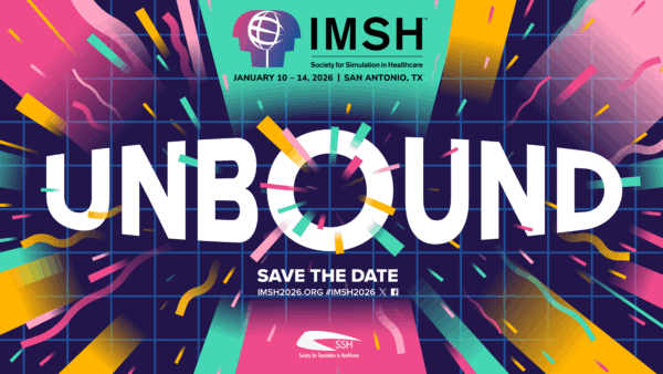
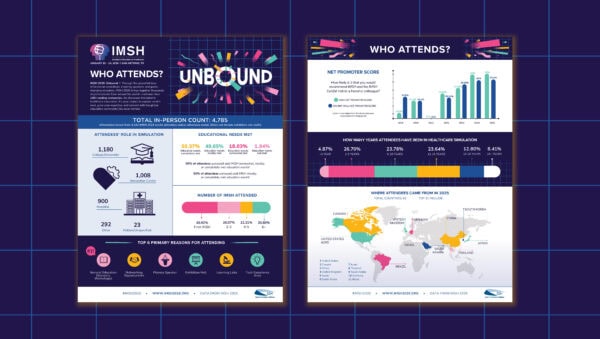
The International Meeting on Simulation in Healthcare (IMSH) is a scientific conference that explores the latest innovations and best practices in healthcare simulation, hosted by the Society for Simulation in Healthcare (SSH). With a theme of “Unbound” for their 2026 conference, I knew the design would need to convey a lot of energy, with a vibrant color palette. The microsite proved to be such an exciting part of this project, as it allowed me to create something that was meant to feel like an isolated moment – something that would get people excited and give them a sneak preview and the feel of what they would experience on-site at the conference. I wanted the design to feel like it could expand outward endlessly, and I wanted the viewer to feel enveloped by its reach. Does the resulting design give you that feeling?
As designers, we’re taught to create experiences, and this microsite allowed me to do that. It served as such an important reminder that small details and moments can transport people.
NASW – Tackling Tough Topics for Magazine Illustrations
Julia Woods, Senior Designer and Motion Artist
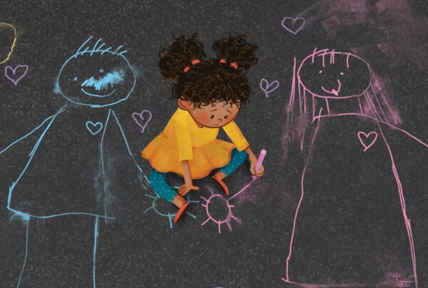
Social Work Advocates is the flagship magazine of the National Association of Social Workers (NASW), serving members as well as social work practitioners, administrators, researchers, faculty, and students. A recent feature on “Shaping the Positive Outcomes for Children of Divorce” was a special issue in both content and execution. The subject matter tackled the social worker’s role in contentious divorces, and we landed on introducing the story of divorce through a child’s eyes, beginning with an illustration of a lonely child trying to draw their family back together with chalk on a blacktop. The interior illustrations show a linear story of a social worker incorporating a custody schedule into the child’s chalk-art, followed by a child happily at play. The illustration style, as well as the typography chosen, is purposefully reminiscent of a children’s book to fully bring the reader into the child’s world.
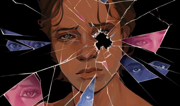
Then, in Fall 2025, the SWA’s “Cruel Intentions” feature focused on the Trump administration’s attack on transgender people. This topic held a special place in my heart and became particularly difficult to sketch because I wanted so badly to get it just right. It was difficult trying to encapsulate political targeting, systemic inequality, and identity struggles – all within one illustration. I landed on the visual of broken mirrors for multiple reasons. It reflected (pun not intended) the personal journey of gender dysphoria and body image issues, as well as the political issue of targeting a vulnerable group of people, breaking up their community and sense of safety. I loved this opportunity of thinking conceptually and testing my illustration skills with stylized realism. I was also able to balance heavy illustration with clean serif typefaces, showcasing the seriousness of the issue. I welcome the rise of serif typefaces and am so excited to show people how beautiful and modern they can be. This feature really allowed me to celebrate both!
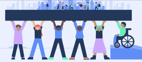
Power to Decide – Doing Social Good through Social Media Graphics
Grace Bockelmann, Graphic Designer and Social Media Manager
The Right Time, a campaign led by the non-profit organization, Power to Decide (PTD), provides training, technical assistance, and funding to expand access to free or low-cost contraceptive methods to health centers across the state of Missouri. PTD came to us to develop a variety of collaterals that stay true to the organization’s brand and initiative while capturing attention and highlighting specific messaging. Since the launch of our creative partnership, using inclusive and diverse design solutions, the number of participating health centers has increased from six to more than 30.
This project represents exactly why I applied to GRAPHEK in the first place: I attended school for graphic design, with a focus on gender and ethnic studies, and I wanted to work somewhere that prioritized designing with purpose. PTD’s mission is just that – I was overjoyed to get to work with this client.
I also found the bold design, illustration style, and bright colors so fun to work with and the execution of the creative process incredibly rewarding. PTD isn’t afraid to use pink – an on-trend color – and they’re open to a fun illustration style that incorporates unique and playful textures that add depth to the work. Combined, we’ve been able to develop numerous unique and extendable brand elements, making it exciting to use them to communicate their message through social media collaterals. Once the base is formed, emphasizing the important parts of the messaging is a breeze.
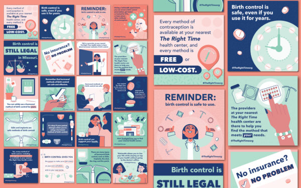
PTD invested in motion, an engaging form of media that really accentuates design elements and creates a narrative and experience. The result illustrates how good design has the power to change the world for the better.
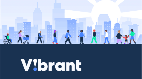
Vibrant Emotional Health – Storytelling with Motion Videos
Nancy Lu, Client Relations and Senior Project Manager
Vibrant Emotional Health is an organization that serves, advocates, and champions emotional well-being for all people and communities. The organization challenged us to create a series of four short videos to serve as resources supporting disaster support leaders and volunteers, focusing on disaster preparedness, self-care for leaders and volunteers, team engagement, and available resources.
This was the first video series project that I managed for GRAPHEK, and, as a result, it was memorable and had its own unique process. Just like all of our design processes, the videos required that important components be in place before designers started sketching the storyboard. We gathered vital information at the kick-off meeting, such as goals, desired target audience, and overall tone and feel; researched music; searched for an appropriate voiceover artist; and finalized voiceover scripts.
This project illustrated so clearly the importance of how the rhythm and speed of music can affect a video, and – of equal importance – how the voice and speed of the voiceover artist convey tone and can play such an important role in helping an organization reach its goals. So many additional, finer details had to be addressed throughout the project, including the selection of music, storyboard revisions, final file size/s, timeline for reviews and approvals, and technical roadblocks.
Storytelling has always been an important aspect of communications strategy, as people can relate to stories more easily than they do statistics, and stories are easier to remember when communicating about an organization or promoting a project (and inspiring donations!).
The four resulting one- to two-minute videos feature succinct scripts that define the problem, offer a solution, and evoke emotions by laying out realistic scenarios for target audiences. It was a feel-good project start to finish, particularly as I knew these videos would provide critically important support to community leaders and volunteers during difficult times.
American Association of Endodontists – A Human Centric, Authentic Rebrand
Ellen Kim, Founder and Creative Director
When the American Association of Endodontists (AAE) came to us with a rebranding opportunity, I sensed it would be my favorite branding project of the year. I love rebranding projects because they give us the chance to shape how a vital association is perceived while carrying the responsibility of representing their mission accurately and creating something custom and unique. We approached the project as a system rather than as a collection of parts, taking the time to understand AAE’s personality, values, voice, mission, and members so we could craft a cohesive identity across all touchpoints for today and the future.
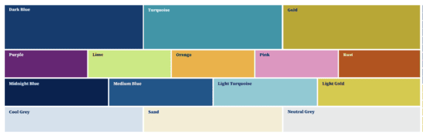
After a thorough brand audit, we preserved the elements that worked while thoughtfully updating what needed to evolve. To inform the refresh, we conducted member interviews, surveys, and communications audits. Next, we developed five visual mood boards to guide custom graphics, a refreshed palette, updated typography, and photo direction.
![]()
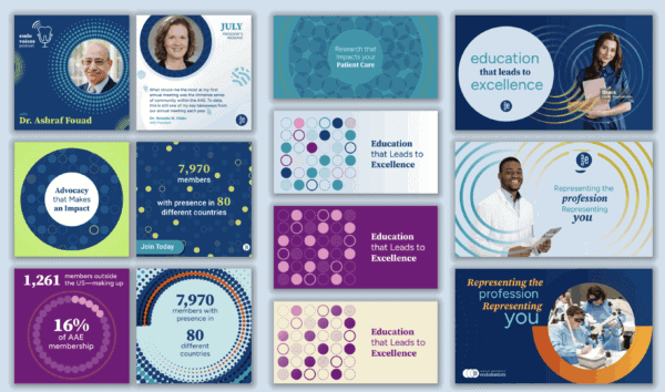
We sought to create human-centric graphics that reflected the people behind the profession and made the brand feel approachable and meaningful. We created graphics unique to AAE, including dots and tapering lines inspired by the logo and dental roots, textured patterns reflecting research, and a custom icon system – all of which unmistakably represent AAE – even without the logo. That kind of recognition is what branding is all about: one unique solution that fits only AAE.
What made this project even more special was the chemistry with the AAE branding team. Like any strong relationship, it was built on trust, collaboration, and shared goals. I enjoyed the fun, laughter, and creative energy throughout the process – even sharing a Korean BBQ meal while visiting Los Angeles to survey AAE members at their conference. Together, we achieved purposeful storytelling through human-centric and authentic design. Rebrands take at least six months, so it’s important to enjoy who you work with. It’s a long journey together.