The National Parks Conservation Association (NPCA) is the voice of America’s national parks, working to celebrate, protect, and preserve our nation’s most iconic and inspirational places for present and future generations. But effectively defending and advocating for the parks – and the endangered species that live within – often depends on their ability to package complex information and research into digestible, understandable formats that pack a lot of data into one package. Enter the infographic.
An infographic communicates data and knowledge quickly. Its imagery, charts, maps, and other visual tools can improve reader cognition and ability to quickly see patterns and trends. And, with an estimated 60 percent of the population being visual learners, infographics can help audiences understand, experience, and remember the data an organization needs to share. When it comes to advocacy, research has also shown that speakers who present using visual aids are 43 percent more effective in persuading audience members to take a desired course of action.
“At NPCA, we need to integrate science into advocacy,” said Ryan Valdez, Ph.D., CWB, senior director of conservation science. “Advocacy is complex, multidisciplinary, team-oriented work, and reaching the people who are making decisions depends on our ability to visualize information. While we have a very large and talented communications division, we turned to GRAPHEK for two recent science-based reports centered around conservation and endangered species. We needed to convey a lot of qualitative, measurable data that weren’t necessarily complicated, but in a world where we need people to quickly understand the issues, vote a certain way, or contact their elected officials, we don’t have a lot of time to waste. Infographics help us get there.”
This process of capitalizing on combining data, design, a compelling story, and ease of shareability into one great infographic is one that we at GRAPHEK regularly work on with clients, with a primary question being, “What story are you trying to tell with the information?” followed by, “How can it be organized so that it’s easily understood?” From there, we think of information in terms of a hierarchy, with the largest component being the desired takeaway with supporting data to enhance that goal.
“Oftentimes, clients don’t start out the project with the data or the vision for an infographic,” said Sarah Gaydos, GRAPHEK’s art director & data visualization specialist. “We like to look at a client’s content with infographics in mind, which helps us see beyond the client’s initial goal and find ways to visually tell their story in a unique and strategic way. We also encourage clients to think through the channels in which they plan to share the content before the project even begins — whether that’s in a printed fold-out report, on social media platforms, or on a website.”
Also important to consider is whether to focus on quantitative representation – think pie charts and bar charts – or on qualitative representation, which is more story-telling in nature and personal, such as through photography and illustrations. The intended audience plays a role, too; if an organization needs to convey high-level, complex research findings to laymen without the time to study it, an infographic is more likely able to do the job than a thick white paper. Similarly, an illustrative infographic generally works better for younger audiences; policymakers on Capitol Hill may respond more positively to more serious quantitative images.
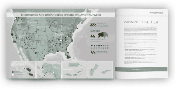
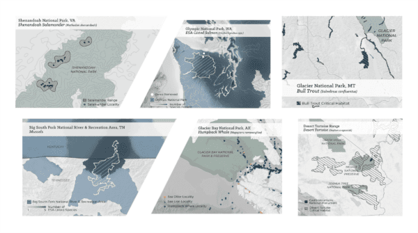
For NPCA, a recent marketing piece intended to educate Capitol Hill policymakers on the nuances and importance of preserving the Endangered Species Act – and ensuring it wouldn’t be weakened through proposed alterations – relied on a series of infographics to highlight the symbiotic relationship between the National Parks and the endangered species that call them home.
“So much of our data are geospatial, and we rely heavily on place- and map-based infographics,” Valdez said. “With more than 600 threatened and endangered species calling parks home, we had to layer statistics, imagery, and icons of animal types that readers could relate to, along with places and states they could relate to, in order to show not only where various species are living, but what regions and parks these species call home. We also need our infographics to be equally effective in reports as they are on social media, and they need to be easily amended. If a species were added or de-listed, for example, we need to be able to easily update the data represented. Every infographic needs to be effective in a wide range of usages and must capture an incredible amount of information. For our endangered species effort, a key takeaway was simple and easy to remember: ‘One out of every three threatened and endangered species call national parks home.’ That’s taking incredibly detailed science and translating it to something anyone can remember.”
We make decisions about infographics based on two primary needs: the need to communicate a certain point to a target audience, such as a donor, member of Congress, or voter, and the need to accurately share the scientific data that backs up our advocacy goal,” he added. “As a science-based organization, we don’t want to just inform our audiences; we want them to look at the science too, so it can play a participatory role and be a tool in informing decision-making.”
Of course, every organization has its own information to share, so there’s no one “best” infographic. In the association sector, maps are almost always universally appropriate, however, as they clearly connect members from all over the country or internationally. Headlines that summarize a key takeaway, illustrations and photographs, and the use of color all go a long way in drawing attention, as well.
“For a medical association, a photograph of someone sitting in a health clinic may not be very inspiring, but for NPCA, gorgeous photos of national parks and animals can be. So much depends on the subject matter as we’re making choices for a specific infographic,” Gaydos explained.
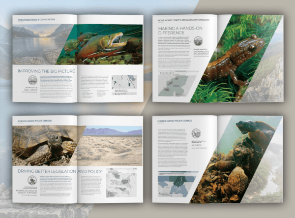
“Without question,” Valdez agreed, “studies from social sciences show us that in our specific advocacy work, photographs of wildlife work. We know that people are passionate and responsive to wildlife, and the ‘cute factor’ is big. That’s why you see Lynx cubs or baby bears; they draw people in more effectively than, say, a species of plant, despite its importance. Similarly, we frequently use images that capture the essence of the grandeur of our parks and geologic formations. We highlight those iconic places because people recognize them and respond to them.”
As a scientist, it may seem at odds that so much of our work is conveyed in a relatively simplistic form,” he added. “But it doesn’t bother me; scientific research is what gets us to our findings, and getting those findings into the community’s understanding is our responsibility. The scientists and the communicators each have their job, and we rely on each other. If infographics mean that science can be more easily shared, understood, appreciated, respected, and acted upon, what’s not to love?”