The world of infographics and data visualization can be daunting, but it doesn’t have to be! Check out these most commonly seen types of infographics and see how they can inspire you to transform your storytelling.
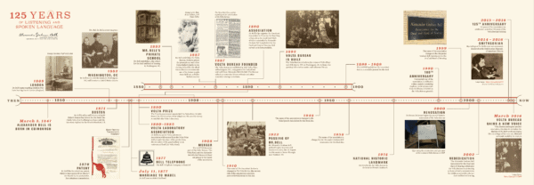
- Timeline: A commonly known infographic, the timeline displays events or topics in chronological order. There are many different types of timelines you can explore, including horizontal and vertical formats. Icons, photographs, or illustrations accompanying events are also great ways to liven up your timeline. Associations often use them to showcase the history of the organization, course offerings, or event deadlines.
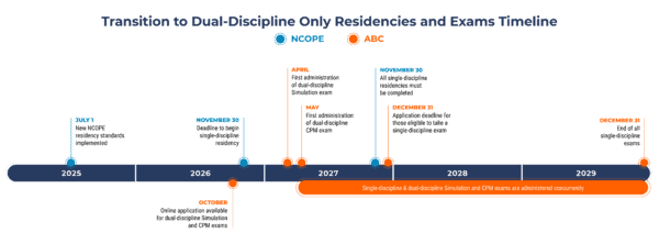
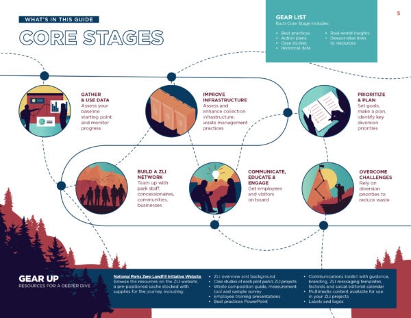
- Process: A process infographic breaks down the summary of steps within a workflow or process. This often includes flowcharts, numbered icons, diagrams, or timelines to guide your reader. Associations often use them in “about us” pages or strategic plans to think through workflow efforts.
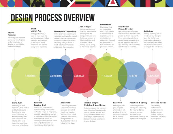
- Informational: This type of infographic brings together text and visuals to simplify a topic or idea. It often utilizes icons or illustrations. It doesn’t use numbers or hard data, so it can be easily applied to your information if data are hard to come by. Associations often use them to showcase types of membership or sidebars in magazines and publications.
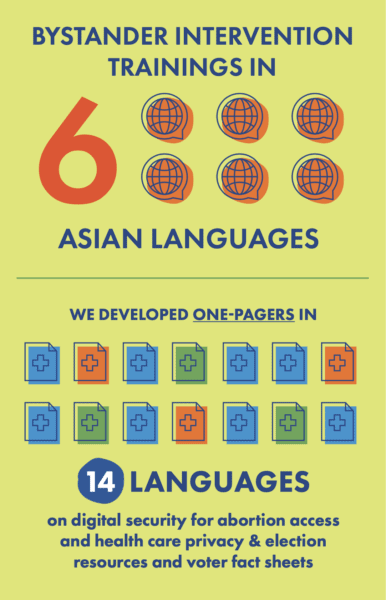
- Map: One of the simplest and most popular form of infographics are maps, as they can easily showcase connections and big-picture data. Maps are often used to show statistics, demographics, or geographical data. We see associations using them in impact reports, annual reviews, or advocacy efforts.
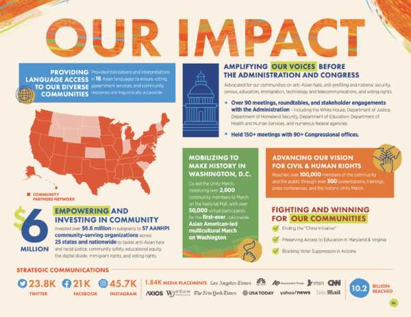
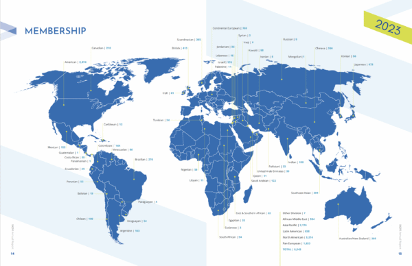
- List: List infographics consist of both written copy and eye-catching visuals. This can help break up long-form text into digestible, bite-size pieces. Associations often use list infographics in checklists – often as sidebars in articles or on social media – and in annual reports and strategic plans.

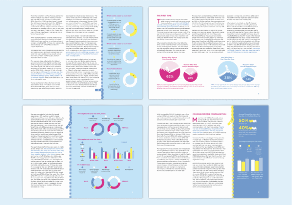
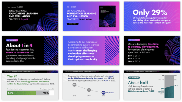
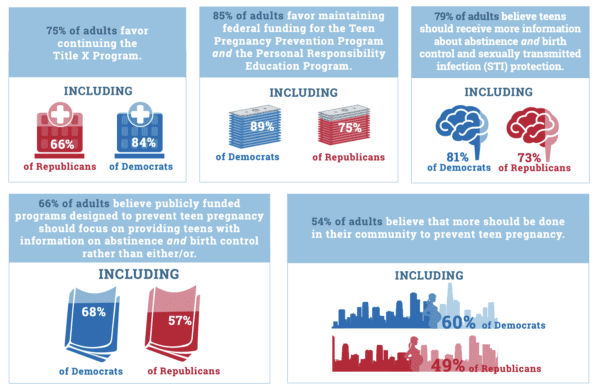
- Data Visualization/Statistical: Data visualization, also known as statistical infographics, showcase data or numbers in quick, easy-to-read ways and can include many types of charts or graphs. Associations often use these in reports, direct mail, and on social media because they’re simple and very scannable.
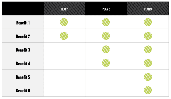
- Comparison: A comparison infographic – also known as a “VS. Infographic” (as in versus) – compares two ideas, concepts, or objects. Associations often use them to compare membership plans or options.
- Flowchart: Often used as a process infographic, the flowchart is a great way to show the steps involved in a process or how something works. They can also be used to answer specific questions by walking the reader through a series of options, revealing the appropriate answer through options that split off or grow based on the options chosen. Associations often use these in annual reports, strategic plans, or membership options.
- Animated: Motion graphics are used in animated infographics to bring movement and draw the viewer in. Associations often use these on social media to stop people from scrolling and focus on their content.
