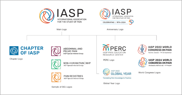
The International Association for the Study of Pain (IASP) was planning a major relaunch of its website and brand and, in the process, felt it was the perfect opportunity to redesign its 11-year-old logo. The association also wanted to develop a series of sub logos for their World Congress on Pain, 50th Anniversary, the annual Global Year educational campaign, and Pain Education Resource Center (PERC). For help, they turned to our team at GRAPHEK.
Logo design has played a steady role in our 25-year history, and while the end results vary enormously depending on our client, the process does not. We begin, unsurprisingly, with research, digging deep to understand why a logo is no longer working and what a client wants out of the new one. We look at an organization’s strategic plan and their mission; hold stakeholder interviews, including with members, volunteers, staff, and Board members; and audit client competitors.
We also research colors and symbols to ensure they don’t have any negative connotations within an industry or, as in the case of IASP, would resonate differently for a global audience. The color white, for example, is associated with death in Korea. Similarly, icons in one culture could mean very different things for another.
“IASP came to us with a good understanding of why they needed a new logo,” Ellen Kim, our founder and creative director explained, “and as the world’s largest association of scientists and clinicians dedicated to the treatment of pain – with more than 6,000 members representing 125 countries – more than half of their membership is international. Clearly a global feel was important! It had to communicate more than that, however; it needed to also convey the study of pain. Ultimately, a continuous, globe-shaped swirling line showcased the relationship between pain and pain relief through the use of mirroring.”

To help clients focus on design over variables like font or color, GRAPHEK always presents first-round concepts in black and white sketches. Only after a client chooses the final logo design do we build in more personality through fonts and colors.
“At that point, we also lean heavily on the research we conducted at the outset,” Kim added, “to make sure we’re not using similar colors as competitors. We map out the architecture of the brand and logo, figuring out which part of the mark can be shared for special interest groups, committees, or meetings. There are multiple layers, and we need enough stakeholder voices to ensure all interests are represented. Usually, that means six to eight people for most associations.”
To help our clients drill down to the winning logo, an attribute exercise – much like a mood board – helps clients categorize what they like and want to keep and what they want to leave off or minimize. Through every step of the process, our goal is to help guide the team through a series of small, incremental decisions.
“In the end, we want to land on a logo where every single ingredient is critical. Much like my favorite logo – FedEx – you cannot remove anything from it,” Kim added. “There’s no ‘extra’ or fluff. With IASP, the two loops have to work together, to show pain and the subsequent relief.”
If a client needs extension logos, our goal is to make them different enough that they’re distinguishable from the association logo but share a main element that keeps it solidly within the same family. IASP had a World Congress in Amsterdam and Toronto, for example, and GRAPHEK retained the swirling lines but looped in the shape of tulips and the CN Tower, respectively, to represent the specific, unique Congress locations.

Angelo Bouselli, director of marketing and membership at IASP, sees the World Congress logos as ideal examples of how meetings can visually represent everything the organization stands for while connecting the central association with all of its events and members.
“These World Congress logos represent the members, the research, and our effort to bring together this global community of pain researchers,” he said. “Yes, the program and meeting logos can stand on their own, but they also connect very clearly to the IASP logo. When you see one, you know it’s an IASP program and part of the IASP brand. GRAPHEK makes those connections so well, and by leading us through a series of exercises that touched on every detail, they developed not just the logos, but also the association and Congress brand guidelines.”
That kind of collaboration between the GRAPHEK team and the clients’ review team is a critical part of our process, and we encourage our clients to think very carefully about how to assemble their committee. Having “too many cooks in the kitchen” can be as challenging as having a new reviewer swoop in at the very end.
“We selected our team from a range of stakeholders,” Bouselli said, “including our CEO, COO, and director of education, who really served as the visionary for our group. We have an engaged leadership, and we set out early to manage expectations in terms of how many would be involved. By establishing guidelines internally, we had a committed group and came away feeling satisfied and confident that the winning designs were exactly right for our needs.”
To help protect and preserve the integrity of every brand and logo once they’re finalized, GRAPHEK carefully presents and guides our clients after the files are transferred, as well. A standard part of our logo process is meeting with our clients to share tutorials and logo guidelines, much like style guides, ranging from helping them understand how printing processes can result in color changes to explaining how some formats work better for specific usages. We also provide 60- and 90-day check-ins to make sure that real-world usages are working in all formats.
“Logo guidelines are living documents,” Kim said. “After a year or so, we may realize it’s time to tweak something, and that’s normal. It’s a regular part of keeping brands and logos fresh, and we work with our clients as true partners. We don’t want to just let a logo out into the world without continuing to check in and make sure it’s working as intended.”


