Project Overview
GRAPHEK partnered with NBOA to conduct a full-scale rebrand complete with extensive research and an inviting brand that would appeal to their multiple audience segments and drive membership engagement.
NBOA is dedicated to developing, delivering, and promoting best business practices to advance independent PK-12 schools. They offer online and in-person programming as well as a range of resources covering timely and relevant topics for independent school business and operations professionals. Through this rebranding effort, NBOA wanted to enhance their value drivers of providing strategic guidance, creating a member-centric environment, and being forward-thinking in the industry.
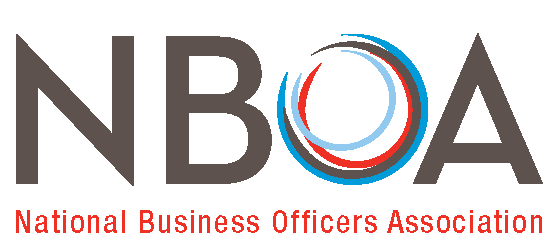
BEFORE
AFTER
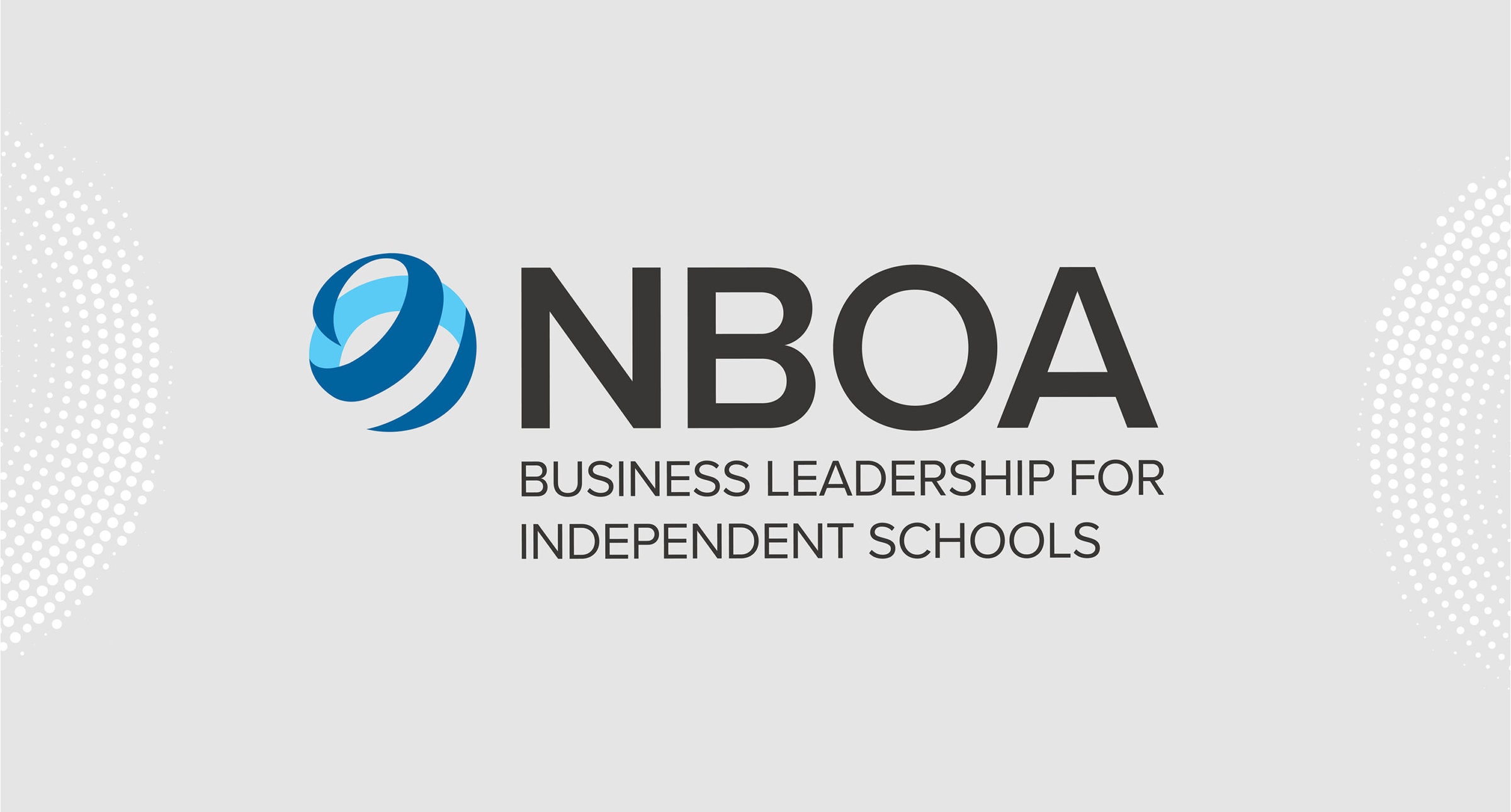
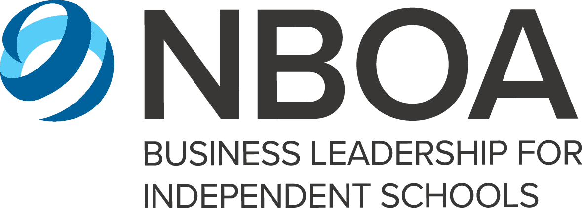
The new logo design functions as a 3D evolution of the old NBOA logo. Visually, it showcases active embracing movement, service mindedness, and inspirational depth. The negative space works with the logo to maintain its circular shape, representing a holistic yet open approach to the world of school business excellence. The colors are bright and inviting and provide a sense of familiarity from the blues in the original logo, but also creates a modern and refreshed tone. The versatile mark can be used with or without the accompanying tagline.
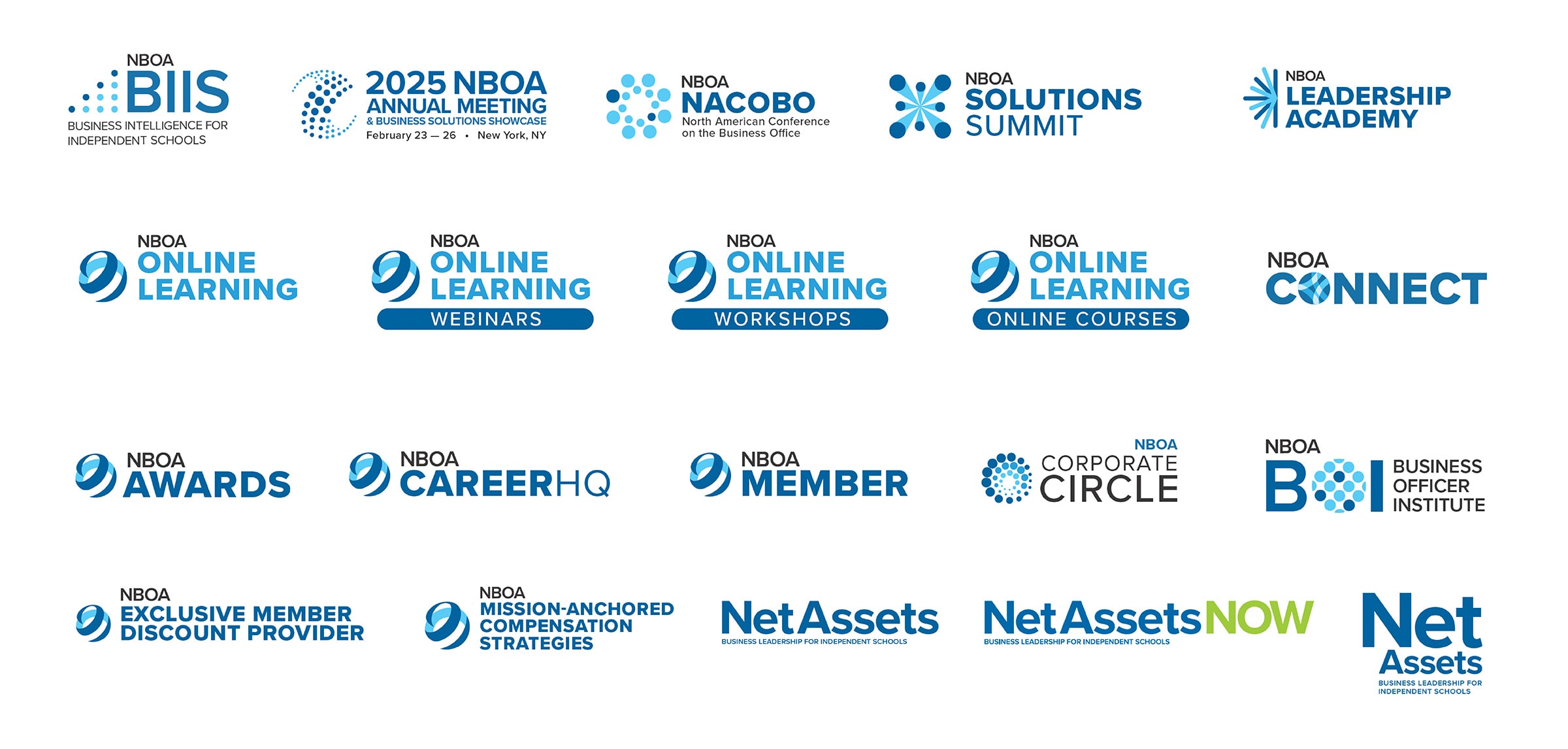
GRAPHEK then created a suite of sub-logos that work with the main logo to translate the new brand across their programs and other member touch points. These sub-logos consisted of three types: unique logo marks that incorporate the same style, tone and colors of the main logo; logos that are moderately tied to the main logo incorporating similar elements as well as style, tone, and colors; and finally logos that use the same mark and text structure, but incorporates different program names.
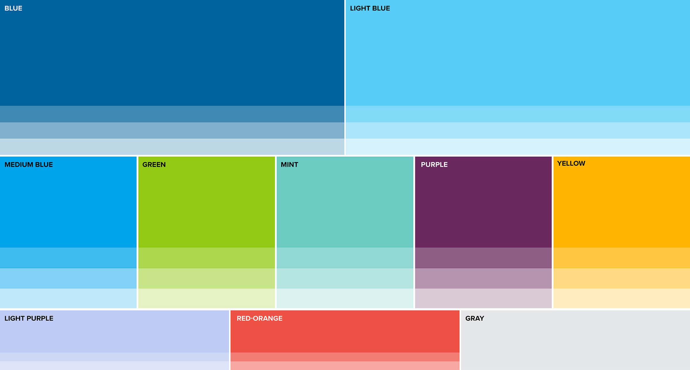
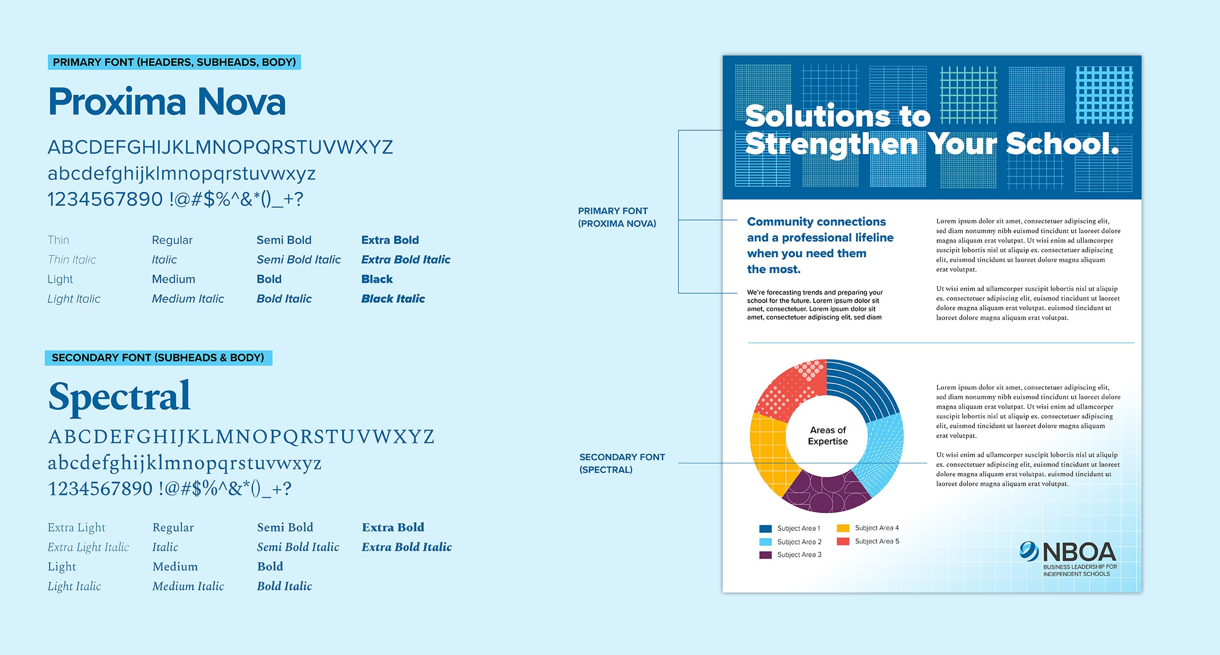
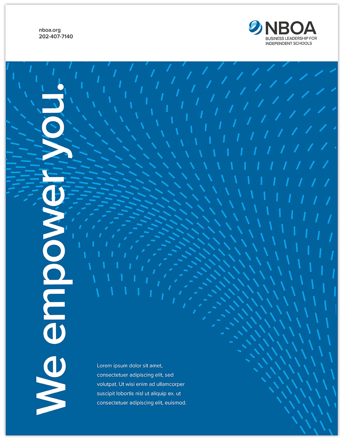
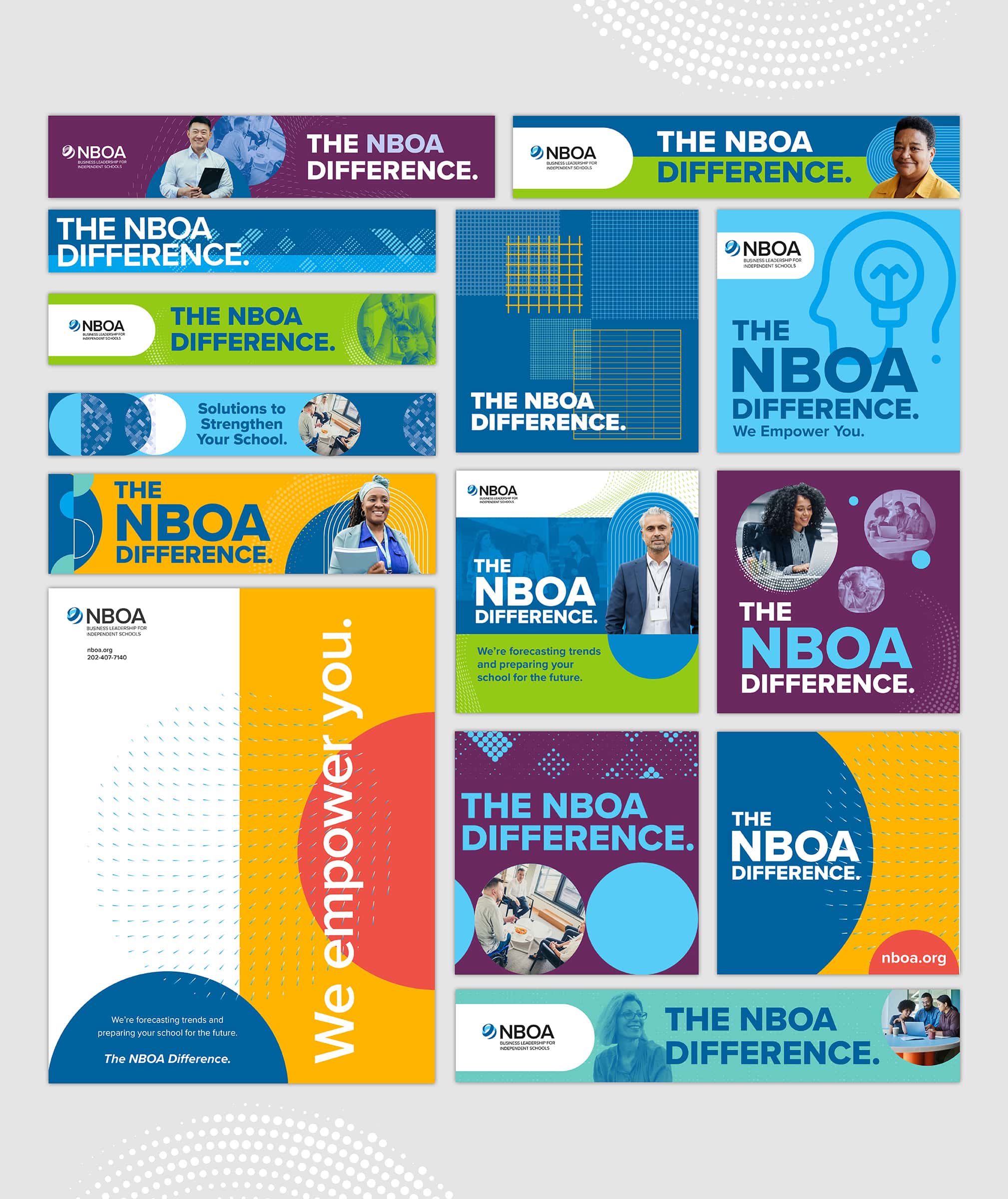
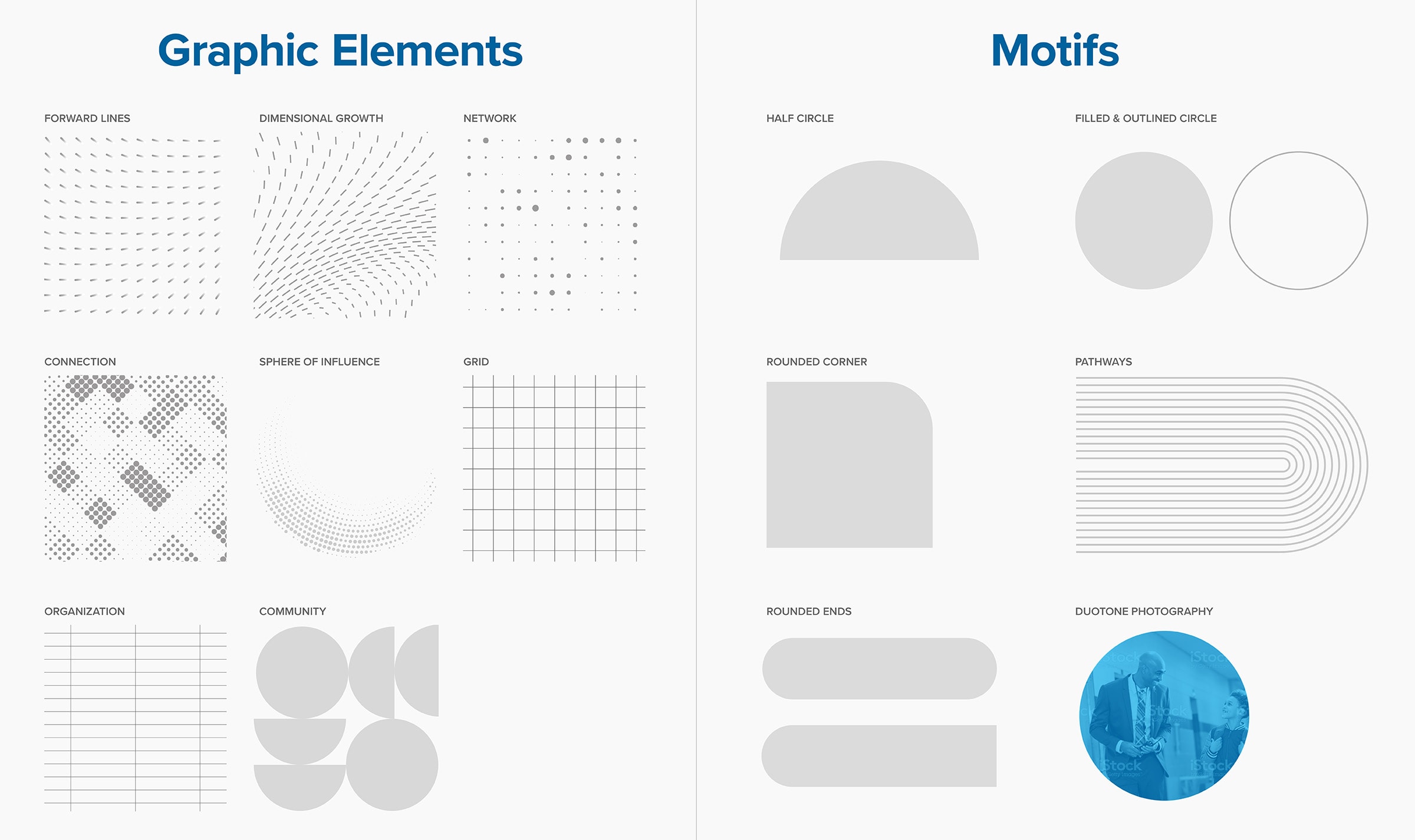
The established brand uses custom patterns that were developed to echo aspects that business leaders in independent schools interact with daily and themes that represent membership benefits such as, growth, community, and resources. Motifs are used to help tie the brand together using distinctive design elements that pair well with a combination of patterns and images, and can be adapted across a span of collaterals.
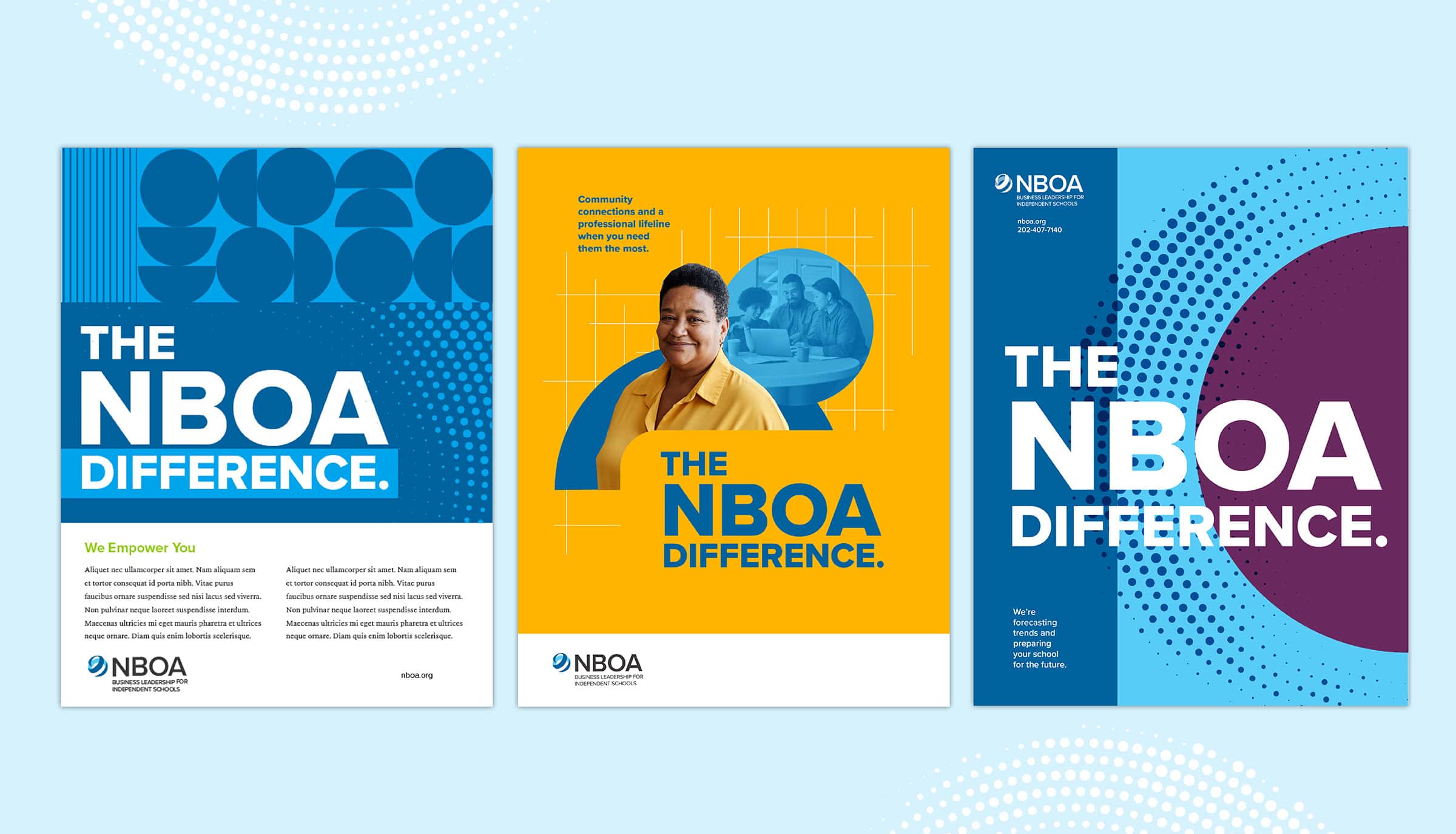
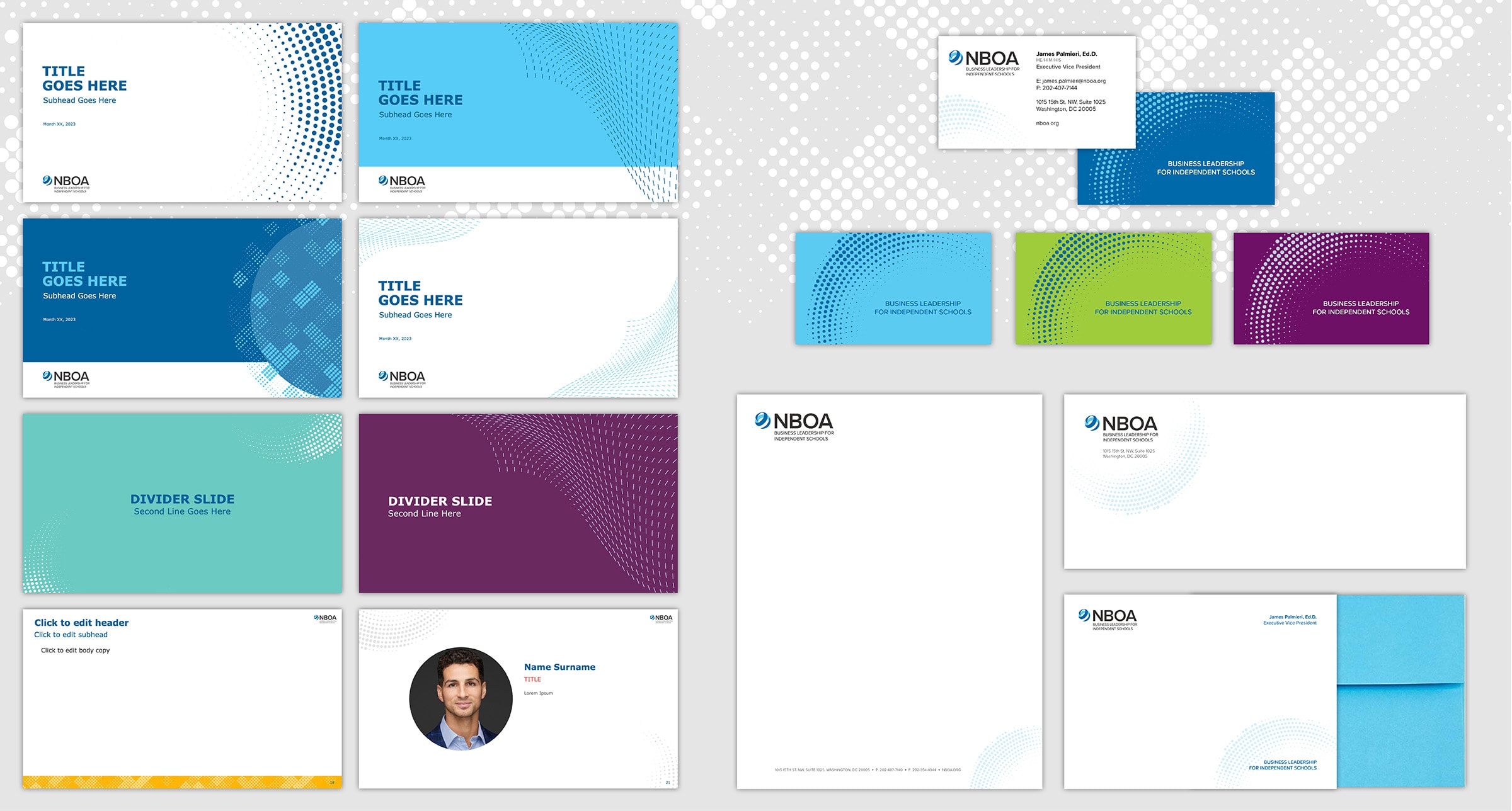
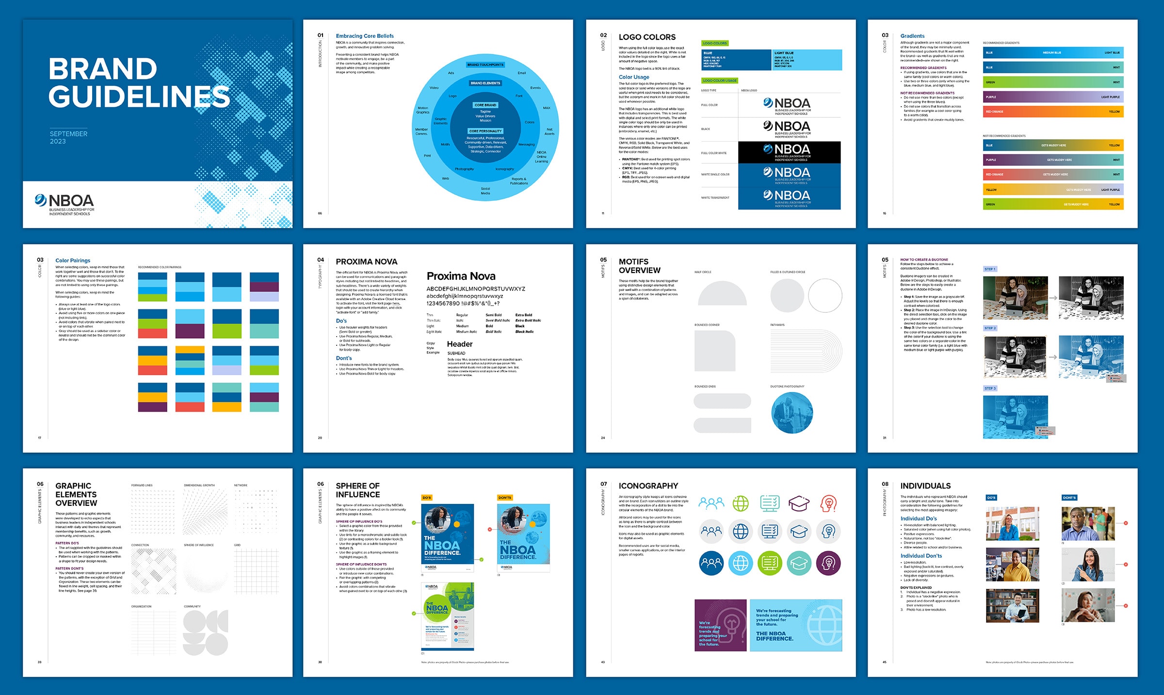
These brand assets allow for a variety of application usage that will remain fresh for years to come. GRAPHEK created brand collateral extension that utilizes these assets, developing a suite of unique and fresh designs that is easily implemented across the brand. This included advertisements, website graphics, email graphics, social media graphics, stationery, and PowerPoint templates. GRAPHEK also produced comprehensive brand guidelines and conducted a staff training tutorial to provide clear guidance on extending the brand.
When NBOA embarked upon a re-brand for the association, it conducted a comprehensive RFP process and GRAPHEK rose to the very top of our selection. The GRAPHEK team was very responsive to our overarching goals for the effort and made a strong personal connection with the NBOA team. Throughout the process they have demonstrated a keen interest in member research, great expertise, impressive creativity, and facilitated a true dialogue with our staff that has yielded excellent results within our budget. NBOA has found a valuable partner in GRAPHEK and it is very likely we will seek them out in the future to advance our marketing and branding efforts!"
JEFF SHIELDS, FASAE, CAE, PRESIDENT AND CEO AT NBOA

The clear, consistent, and modern approach clearly distinguishes them from other organizations and makes NBOA instantly recognizable in the community.
