In December, Pantone announced its 2026 color of the year: Pantone 11-4201, or “Cloud Dancer.” It was described at the time as “a lofty white that serves as a symbol of calming influence in a society rediscovering the value of quiet reflection.”
Critics disagreed, and reaction from the public was swift and harsh. Pantone’s choice was called boring and tone-deaf, dystopian and serving a white supremacist agenda in today’s social and political landscape. At best, it seemed a questionable choice for a process that was intended to draw attention to the relationship between culture and color, and – while it certainly engaged the design community and color enthusiasts in a conversation around color – it did so in a way that felt painful and negative.
The backlash, while undeniable, led many to dig a little deeper into what color really means, including the design team at GRAPHEK. What would we have chosen, we asked ourselves, if we were asked to choose a color of the year?
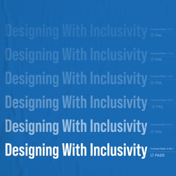
As we shared in “A World of Color, from Theory to Application,” color is a body of knowledge that studies the interactions of colors and how they make us feel. When we work with clients to select colors for logos, brands, and collateral, we consider the psychological role of color (imagine a hospital room painted red); the science of color (how colors print and how color schemes, hue, and saturation all interact); color studies (considering contrast and how colors pair with another); and accessibility (taking into account how those with visual impairments may have different perceptions of color and contrast).
But to select a “color of the year,” taking a look well beyond these tenets – and considering world influences at the same time – seems appropriate. The selection process at Pantone, the company says, “is a culmination of the macro-level color trend forecasting and research that the global team involved with the Pantone Color Institute conducts year-round, as well as the colors that get included into our color trend forecasting products.”
At GRAPHEK, we agree that Cloud Dancer missed the mark.
Instead, what would we choose? During an internal discussion and brainstorming session, we challenged ourselves and each other to consider what GRAPHEK’s Color of the Year would be. A wide-ranging, thoughtful, collaborative, and intentional conversation felt both emotional and strategic – just as it is when we approach color for any client project.
“I’d go for a color that is resilient, stable, and durable – something that feels strong and unbreakable,” founder and creative director, Ellen Kim said.
“I’d lean toward a color that feels like rebellion – that’s nonconformist. Or a color like indigo, which remind me of a beloved pair of jeans and feels grounded. It’s a color of the working class and is associated with profound thought, devotion, wisdom, and justice,” added art director and brand strategist, Christina Davies.
“Blue,” interjected Julia Woods, senior designer and motion artist, “in the vein of feeling hopeful during a time of chaos. It’s different than a ‘happy’ color like yellow – we’re not out of the woods yet – but a sky blue alludes to clear(er) pathways ahead and provides a sense of asylum that sunny days are ahead.”
“The color pink,” added Graphic Designer and Social Media Manager Grace Bockelmann, “is a reclamation of a color that’s considered feminine or girly, but it can actually be very powerful and versatile. It’s adjacent to red.”
GRAPHEK’s Color of the Year
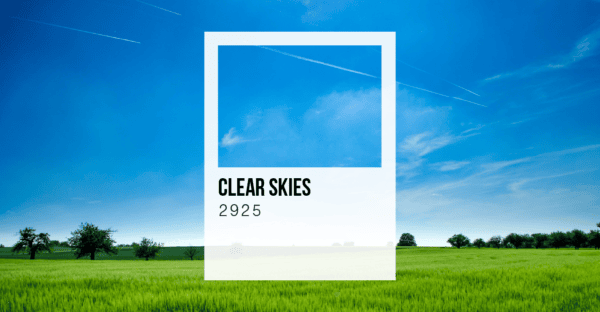
The easy part was rejecting Pantone’s selection of white. Much harder was landing on “our” color – but after debating, sharing, and exploring a wide spectrum of options, we found ourselves turning to Pantone 2925. In the blue-purple family of colors, Pantone 2925 harmonizes with lighter blues and turquoises. If we were given the opportunity to name it, we’d call it Clear Skies.
We ultimately chose it out of a desire for connectedness. The sky is universal; no matter where we live – in deserts, tropics, mountains, plains, or the arctic, we see the same sky. That symbolism of unification feels particularly important now, and while skies can of course be stormy, a clear sky is almost universally calming. A clear blue sky and a body of water are harmonious, as each reflects blue on another, just as humans are in greater harmony when we reflect and consider each other’s experiences, truths, and feelings. It gives a natural energy, sometimes throwing equally blue shadows on a sunny day.
It’s a livable color with an inherent human connection, with a positive, serene emotional response. And in today’s times, that feels just right.
What would your color of the year be? Share your thoughts, tag us @GRAPHEKInc and share our newsletter with colleagues. Let’s make this the year we connect, inspire one another, and recharge – together!