The Americans with Disabilities Act (ADA) transformed the lives of people living with disabilities, as they were given protections in the areas of employment; public entities and public transportation; public accommodations and commercial facilities; and telecommunications. But as the Internet transformed all of our lives and put much of our work, research, and entertainment online, new challenges emerged for those with any disabilities that impaired their ability to view and understand electronic documents. Enter Section 508, an amendment to the Rehabilitation Act of 1973, which requires that all federal electronic content be accessible. Technically speaking, section 508 applies to federal agencies – not non-federal agencies or websites unless those entities are providing covered services or products to federal agencies. But practically speaking, more and more private companies, trade associations, and organizations are creating online content with 508 compliance in mind not because they’re required to, but because it’s the right thing to do – and it means they can reach all intended audiences.
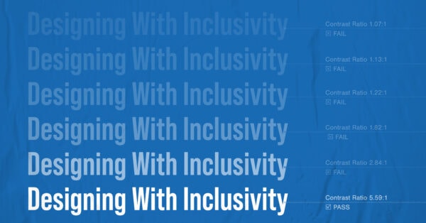
From our standpoint as designers, 508 compliance has become an important part of our work with many of our partners. Our accessibility efforts take a variety of forms; we carefully select fonts with characteristics that make them more legible online, for example. (Fonts that are less stylized, with clear differences between letterforms and balanced width and height, work best online.) We focus on incorporating enough contrast between background fill colors and text, and we pay very close attention to color palettes. One in 20 people have some form of colorblindness, in fact, reducing the range of colors they can differentiate between and potentially making two colors appear as one.

Thankfully, our efforts don’t depend on guesswork, as 508 compliance has introduced a wide array of resources that allow users to check issues, such as this contrast checker, which looks at graphics and text, and this color contrast checker, which focuses more on color pairings. We’ll sometimes find that our original concepts won’t work as originally envisioned, but if someone can’t read or decipher the content, then we’re not communicating effectively. Accessibility is a top priority.
A recent project brought to light the importance of 508 compliance, as we worked on the We Think Twice campaign, a digital media campaign aiming to build teen knowledge and skills to form healthy relationships with peers and adults; set and achieve their goals; and make healthy decisions relating to sex, substance use, and other topics relevant to teens.
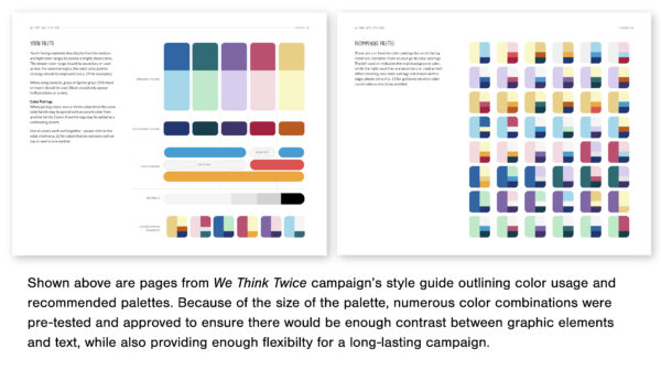
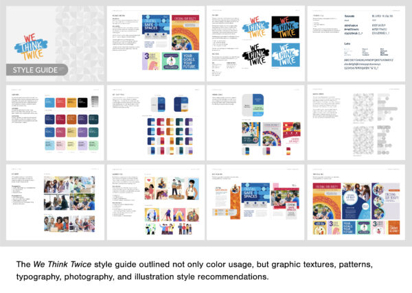
We Think Twice, funded by the Family and Youth Services Bureau, needed a 508-compliant style guide to ensure that everyone is able to consume campaign materials regardless of ability. RTI International, the contracting organization responsible for implementing the campaign, hired GRAPHEK to create a very thorough style guide. Led by Art Director & Brand Strategist Christina Davies, our designers researched and provided exact details on acceptable color palette combinations, font styles and sizes, and even details for typefaces that could be used as headers, subheaders, and body text. It was an intense project, but the goal was to provide their design and communications team a clear guide that would allow them to create accessible content more easily and quickly and ensure that their audience can consume everything they’re releasing.

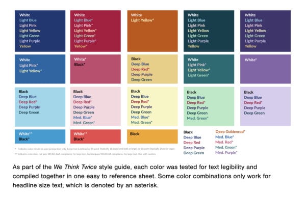
We wanted to be able to provide a guide that very clearly outlines what colors work together so that no one has to guess or constantly check online resources to find out. We’ve built 508 compliance into our internal quality control checks, as well, and we have a team that is trained in 508 compliance. Having this common touchpoint for content creation is so important.” said RTI’s Amanda Seagroves, research public health analyst.
As anyone who’s ever tried to buy a paint color or rug online knows, however, monitors vary greatly in how they represent true color, so we always advise our clients to use the actual color source codes. Internally, Seagroves also recommends formalizing your organization’s brand color palette with 508 in mind and documenting which colors can be safely used with others. When choosing fonts, also keep in mind the kerning – how letters are spaced in relation to each other – so that you don’t risk blending letters and making it hard for readers to articulate each letter. Visual interest is important, but readability cannot be sacrificed.

There are many lessons to be learned, too, about writing inviting “alternative ‘alt’ text” – verbiage that describes an image.
“Try to not be overly literal,” Seagroves advised. “Rather than saying, ‘This is a picture of a person …”, say ‘A young woman gazes …’ And, with short-form videos, be careful when adding music as a background; some people find it very difficult to distinguish between multiple sound streams, so if there is someone speaking in a video and there’s music playing in the background, it can be hard to understand the speaker’s voice.”
Some may view 508 compliance as yet another step, a chore, or a hurdle that can crimp creativity. But we don’t see it that way; instead, it’s an inclusive way to make your organization accessible to all through universal design guidelines. Whether that means adding Alt text, closed captioning, or thinking about color contrasting and font styles, all users benefit when your content is easier to understand and process. By making your content accessible, your audience can focus on your message without being distracted or shut out entirely. Accessibility is good for everyone.


