According to PANTONE, the human eye is able to perceive potentially millions of colors. With so many options from which to choose, how do we as designers go about selecting the “right” ones? Through color theory, of course!
Color Theory
Color theory is a body of knowledge that studies the interactions of colors and how they make us feel. This means we must look at color through the subjective lens of emotional and cultural contexts, as well as through more objective areas like color mixing, contrast, and the limitations of color ranges in printing and digital devices.
The Psychological Role of Color
Imagine you are in a waiting room to visit a doctor. Think of the colors that surround you in that environment — are they soft pastels? Calming blues, teals, or perhaps beige? Now imagine you’re in the same waiting room, but the walls are bright red. How would this make you feel as you wait for your appointment?
Color has a huge impact on our emotions, and designers need to be aware of the psychological effects of each color, as well as have some level of understanding of their cultural context. Color choices are dictated by the audiences with whom we’re trying to communicate; for example, due to the role of purple pipes in recycling water, purple has special relevance for members of the California Water Environment Association (CWEA), leading us to incorporate purple in their 2024 meeting materials.

Left: AC25 Branding, Right: Purple pipes, Stanford University, Palo Alto, California. JOHN LOO/FLICKR
Color can also impact the tone of a piece or be used to help tell a story. For example, in the award-winning 2018 October-November issue of Social Work Advocates, we were tasked with helping illustrate the sensitive topic of suicide. Here, the intentional lack of color is used to amplify the emotional impact of color as the article progresses.

Marie Nguyen, director of institutional giving for Asian Americans Advancing Justice (AAJC), noted in particular our efforts to convey tone and keep audience in mind whenever we work with AAJC to create projects such as their annual reports which are uniquely themed year to year and the American Courage Award, which uses yearly color updates as a core branding element.

“The GRAPHEK team truly stands out with their remarkable understanding of the relationship between vibrant colors and captivating designs and how these elements impact our perception,” Nguyen said. “Whether we seek to evoke a sense of courage, power, optimism, or even something more abstract like forward movement, GRAPHEK consistently and seamlessly translates our deep discussions about our journey and motivations into a stunning final product design. GRAPHEK’s attention to detail in color has transformed our materials, making them visually striking and emotionally resonant for our audience.”
The Science of Color
Color mixing and reproduction is a science unto itself. In programs like Adobe Illustrator and Photoshop, designers are presented with various color models to craft our colors. Below are some color pickers we navigate on a daily basis:

By having a background knowledge of the color wheel, color schemes, hue, and saturation, designers are able to navigate and fine-tune color selections with precision. Though our eyes may be able to perceive a seemingly infinite range of shades and hues, designers must be mindful of the limitations of ink and pixels: The range of colors we are able to use dramatically shrinks as we move from the expansive light-based color gamut of Red Green Blue (over 16 million possible colors) to printable Cyan Magenta Yellow Key inks (about 16,000 possibilities).
PANTONE provides additional colors to the printed medium by creating a range of inks CMYK is unable to reproduce. By using PANTONE’s Color Bridge swatch booklets, designers are able to see how different color mixes of CMYK look on paper and find its closest PANTONE match. Notice, however, that certain PANTONE colors are much more vivid than their CMYK counterparts by virtue of being solid, premixed inks with a wider range of pigments to work from. Where possible, we try to choose colors that have a closer match between PANTONE and CMYK appearances to avoid surprises or confusion.
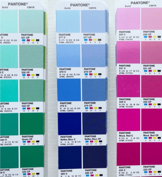
The swatches on the left of each panel is the PANTONE ink version. The right side shows the closest CMYK match. Notice how some colors on the left side are much more vivid than their CMYK counterpart on the right.
Another layer of complexity to printing color falls to what kind of paper stock is used. Ink interacts with coated paper differently than uncoated paper because ink settles into the paper more when it’s uncoated, giving it a duller appearance. Therefore, if we know that a brand or project will use uncoated paper, we need to account for that to ensure color consistency across all platforms. To see a direct comparison, the above color swatches are printed on coated paper. Now, compare those to the below color swatches, which are the exact same colors but are printed on uncoated paper:
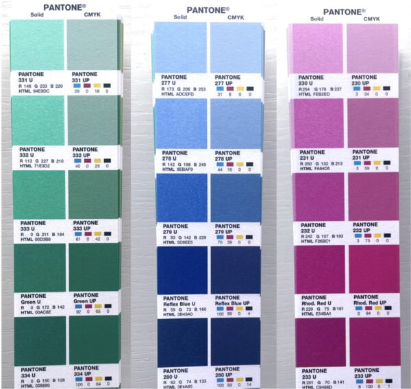
Notice how the colors themselves appear marbled and speckled due to the texture of the uncoated paper. Even the color of the paper itself will have an effect on the print color. Color is not an abstract concept — it exists in the physical world and interacts with materials differently.
Color Studies
When we decide on a color palette, the story doesn’t end there. If, for example, we’re working on a logo or a branding project, we will often go through an extensive process of color testing. This process involves selecting specific shades from PANTONE and making sure the shade looks good across print and digital platforms. We will also test different shades with other colors from the palette to ensure there’s good contrast and to avoid color vibration, which is the visible tension certain colors have when put directly next to each other.

Color studies of a red and grey palette.
Accessibility
People with visual impairments have different perceptions of color and contrast, so designers need to take that into account to ensure that information is legible. Many people have fewer color receptors in their eyes and experience color blindness, for example, making certain color combinations difficult to distinguish, such as red and green. By following the Web Content Accessibility Guidelines and checking our color values through various online tools, we can ensure our designs are accessible to as many as possible.

Additionally, design programs like Adobe Photoshop and Illustrator have filters that allow us to see how designs may be viewed by those with specific forms of colorblindness.
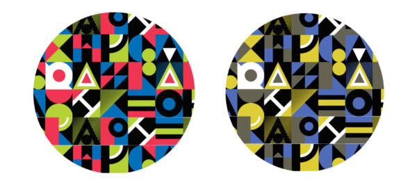
GRAPHEK’s custom pattern and how it would be viewed by a person with protanopia-type color blindness.
Final Thoughts
While there are many more aspects of color to explore, these considerations are typically a starting point for many of our client design projects. In sharing some of the key steps we go through with our partners, we hope you’ve gained a deeper insight into the world of colors – and that your newfound knowledge will give you a greater appreciation for the many decision points we’re prepared to make with you and your team!


