We talk a lot about branding, with the expectation that just about every organization will need to rebrand or refresh their brand at some point. There are signs that will help you decide whether a rebrand or refresh makes more sense, and there are strategies that can help ensure the ongoing strength of your brand. Today, we’re going to take a look at the exercise from the inside, pulling key takeaways from a major rebranding – and name change – that required problem solving, accessible design, and seeing the value of a total brand revolution.
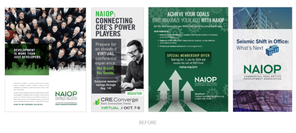
First, the client: NAIOP, Inc., as it’s been known since 2019, was founded in 1967 as the National Association of Industrial Parks (NAIOP) and is a leading trade association for developers, owners, and investors of office, industrial, and mixed-use real estate. With 22,000 members, 55 chapters across North America, and 68 Board members and 12 executive committee members, the association had grown in size and diversity, and in 2024, NAIOP released an RFP seeking help with a rebrand to better capture the full scope of its modern membership.
The challenge: In addition to answering the core question of whether the association had outgrown its name and brand, leadership knew that with 55 chapters – some with large, multi-departmental staffs and others with only a single staff person – finding an accessible design platform where chapter staff could create and extend branded collateral would be critical to the brand’s overall success.
“Our strategic plan was the catalyst for examining the need for a name change,” said Kathryn Hamilton, vice president of marketing and communications, “and we recognized a knowledge gap in terms of how our members’ portfolios had responded to changing market trends in office, industrial, and retail. Our roots are in industrial real estate, but we needed to know – through an ambitious campaign to collect more data – if our name still accurately represented us. We also had members tell us that precious time spent advocating with legislators was often eaten up by the need to explain who NAIOP is.
“We needed clarity, and a collaborative brainstorm and discussion amongst members, the Board of Directors, staff, chapter representatives, and other leadership began. The legacy of our association was always in the forefront,” she added, “and we were mindful that we weren’t changing who we are. We were clarifying who we are.”
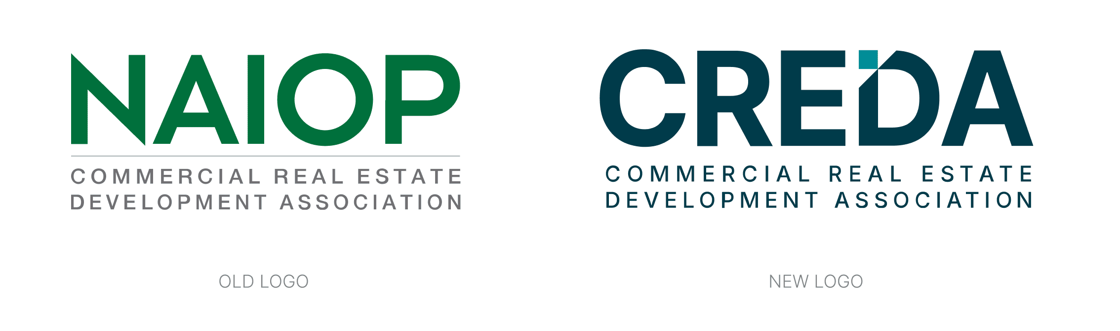
The solution: The association’s executive committee ultimately recommended changing the name to the Commercial Real Estate Development Association (CREDA), the board of directors passed the vote, and it became time to bring the new brand to life.
The need for a uniform platform to create marketing collateral across chapters led CREDA to Canva, an online design tool, and they discovered that by purchasing an enterprise license, they could provide every chapter access to the same resources.
It was an important decision, and one that was in line with GRAPHEK’s firm belief that extending the new brand is just as important as developing one. At GRAPHEK, we believe that it cannot be assumed that an association brand will be extended by designers, as so many associations and chapters may not have the resources.
Choosing Canva as the design platform also proved to be an exceptionally fun challenge for GRAPHEK, as we sought to build out the brand and guidelines in a way that they could live and grow on Canva. We had to be thoughtful on how designers and non-designers could extend the new brand with confidence and without compromising the overall design solution.
“Chapters need to design materials for a huge range of uses, such as for golf tournaments, webinars, and galas,” Walter Kim, GRAPHEK’s managing partner and strategist, said. “In the past, some chapters would call association headquarters for last-minute help, and it was a constant scramble to create collateral for chapters with such disparate needs and design talents. By using a platform as uniformly accessible as Canva, every chapter could take ownership of their own marketing initiatives. The strategy meets them where they are and empowers chapters.
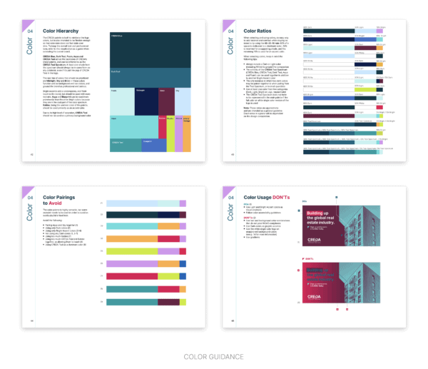
“There’s no hunting around for palette colors or hex codes, wondering how much padding is needed around a logo, or whether it’s okay to rotate an element for spacing purposes,” he added. “We created a guide that consolidates everything in one place, knowing that chapter staff have a wide range of design skill and experience.”

The result is a streamlined process that helps chapters focus more on their creativity rather than getting bogged down by trying to find and interpret brand guidelines.
“Brand guidelines can feel a little scary,” Hamilton added, “but GRAPHEK approached this in a way that highlights the brand’s flexibility. Rather than guessing at colors, they’re packaged in a way that users can simply select what they need. It offers the capacity to express what a chapter wants to communicate while staying within the brand family. We were also able to let chapters decide whether to make their materials shareable; the D.C. chapter, for example, can’t see what the Virginia chapter is doing unless they intentionally share it. The tool provides full access to branding guidelines, logos, color palettes, and graphical elements, but retains full privacy for each chapter’s own creations.”
In a nod to the real estate industry, the GRAPHEK team used building-material names for the color palette, such as brick, foam, sky, blueprint, safety orange, and others. We developed sub-brand logos for every chapter, making the Utah chapter logo as balanced as the North Carolina Piedmont Triad chapter logo, for example, in spite of the significant variation in characters. A sophisticated font, thin rules, and colors that complement reflective glass windows, brick, stone, and other building materials intentionally represent the growth and modernity of a trade association with a long history.
The investment: The brand and its guidelines, designed for the Canva platform, have made CREDA’s new brand infinitely more accessible to a wide range of chapter staff and provides them with the flexibility to create what they need for their audiences. Equally importantly, it’s made the process of maintaining and growing the new brand more organic: As an organization grows and new initiatives are developed, the brand must evolve, and having guidelines and guardrails will help it thrive.
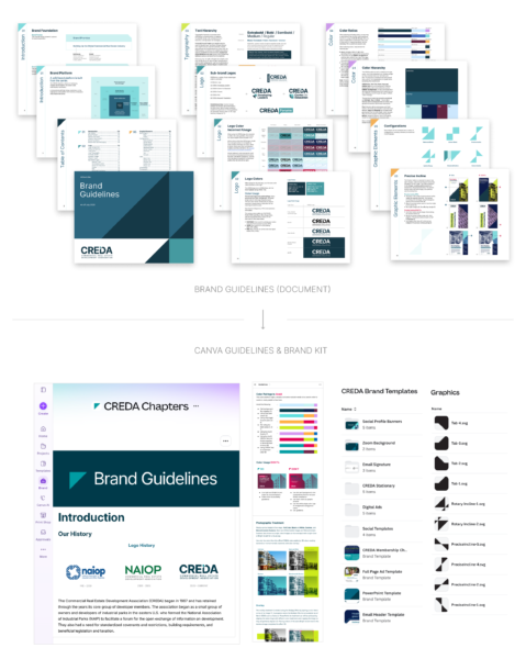
Similarly, understanding how to use the Canva design tool was critical to its success beyond the initial launch. In preparation, we held a series of chapter retreats and webinars, which allowed us to introduce and explain the inspiration and evolution of the brand on a macro level, while drilling down to where various graphic element files could be found on a micro level. Throughout, we remembered that a rebrand – especially a name change – can be a sensitive journey, especially for such an established association with a storied history.
Every step taken was meticulous, inclusive, and intentional. It’s an approach and a process we take to heart with every client, and it’s become as much a part of who we are as the project itself. As Bill Rowan, vice president of marketing and communications for the National Asphalt Pavement Association (NAPA), recently shared, “An aspect of working with the GRAPHEK team that I find invaluable and unmatched is their introspective, thoughtful approach to design, and their abundant willingness to let you in on the process.”
Would you like to learn about our branding process? Let’s chat.