If you’ve been a regular reader of GRAPHEK’s DesignWise, a client since our launch, or even a brand-new client, we’re betting you won’t be surprised to hear us talk about the importance of brand guidelines. We’ve said, in fact, that extending and adhering to a new brand is just as important as developing a brand. And, we believe it: Every time we work with a client on a new brand or rebrand, we also develop detailed guidelines to help them stay consistent in their communications and stay true to their brand. That can mean specific guidelines for everything from color palettes to fonts and typography, from logo rules to imagery styles, or even the usage of voice and tone. It matters, we believe, because by adhering to brand guidelines, an organization can build the all-important familiarity, recognition, and loyalty among their target audience.
For the last six years, we’ve worked with the California Water Environment Association (CWEA), which serves to empower wastewater professionals who represent all facets of wastewater management and resource recovery. After their major rebranding in 2021, we’ve enjoyed witnessing how they’ve lived by their brand guidelines and, in the process, built long-term brand equity.
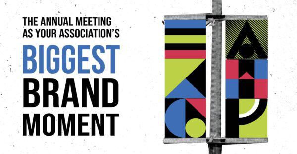
At the same time, they’ve recognized that collateral for an individual event, such as their annual meeting, has a shorter shelf life and can, therefore, open the door to more creative expression. It’s a good strategy: Annual meetings are often an association’s largest source of non-dues revenue and most visible brand experience. Meetings provide members with the opportunity for face-to-face networking and education both in the classroom and on the trade show floor, while the association gets business done with board members and program chairs and can take the temperature on hot topics in the industry.
Combined, it’s a lot to convey – so how does an organization go about creating a vision for their meeting?
“Our brand is our foundation and voice,” said Megan Barillo, senior marketing manager for CWEA. “Through it, we seek to communicate that our organization is proud, confident, knowledgeable, supportive, and authentic, and we want wastewater professionals to see themselves reflected in our work and feel proud of the essential service they are providing. Our annual conference, which draws a wide range of members and professions, gives us room to be more expressive, especially through theme, imagery, and colors. For six years, GRAPHEK partnered with CWEA to develop the creative branding for its Annual Conference, and they so ably guided us through the process, selecting design elements that made each year feel like a different and unique experience. We are enjoying that same process now, as we work with them on our Centennial brand for 2028.
“For our annual conferences, our president will think through how a potential theme reflects their vision, their priorities, and what they want to emphasize during their year of leadership, keeping in mind who we are as an organization while connecting us as a community. As GRAPHEK and our team start developing ideas, we lean on our branding guidelines to make sure we’re not going too far afield, but more than anything, we let those ‘proud, confident, knowledgeable, supportive, and authentic’ terms serve as our brand guardrails. As long as the annual meeting theme clearly and purely represents those words, we are on the right track.”
For our creative team, we find that planning and designing for an annual meeting is a unique opportunity. It often begins a year or two in advance, for a meeting that is only a few days long. We’re going for a sub-brand that’s complementary to the organization brand, with just enough creative frisson to feel exciting and draw people in. In spite of meeting collaterals’ short shelf-life, it’s an important long-term investment when you consider that for many association members, the annual meeting is their one shot at meeting leadership and having a live, in-person experience with the association and other members.
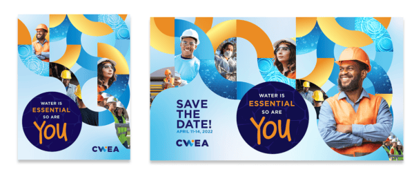
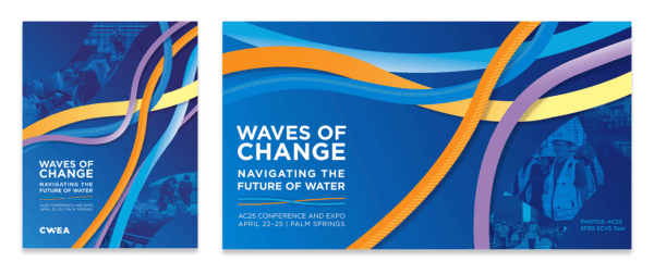
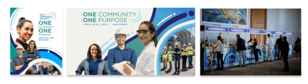
We strive for every attendee touchpoint—from signage and stage design to the mobile app and networking spaces—to feel connected and reinforce the association’s overall mission and identity. We also don’t want the design to feel trite: if a meeting is in Arizona, for example, we won’t depend on cactus imagery. If it’s in Florida, we’re not going with palm trees. Instead, palette colors depicting a southwestern desert or turquoise waters can feel more evocative without being predictable. We also encourage associations to share their meeting brand guidelines with vendors partnering on the annual meeting, such as show planners, videographers, and stage production companies.
“GRAPHEK has a great process to help associations like us build out both a theme and a brand, providing mood boards, inspirational photos and color treatments, and graphic elements to see what we’re drawn to,” Barillo added. “It’s a productive brainstorming session, after which they create at least three draft styles for us to consider based on the information, background, and preferences we provided. Through a series of questions, we eventually land on the winning concept, at which point they create meeting elements and templates, along with a style guide. It’s the complete package – all under the proud, confident, supportive brand ideals that are so important to CWEA.
“We have 17 different local sections,” she said, “and our annual conference is the one place where we can all gather and collaborate, and we use our meeting as our opportunity to celebrate our membership and their efforts all year long. Having a meeting brand consolidates that feeling of belonging and reminds people why it feels so good to be there. The process is worth the effort.”
Are you ready to make your next annual meeting a true extension of your brand? Give us a call!