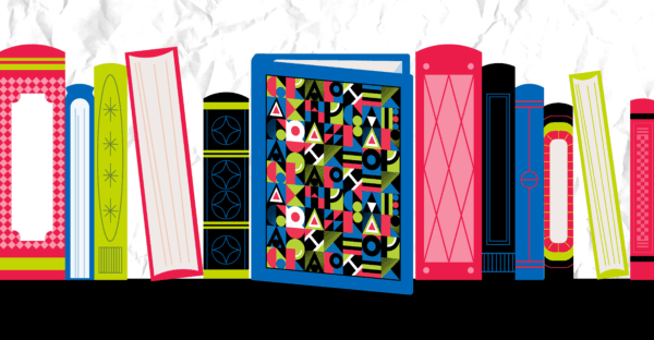
How many times have we thought to ourselves we know we’re not supposed to “judge a book by its cover,” but we have, and we do. Frequently, right?
At GRAPHEK, we do it all the time … because in our role as designers for our mission-driven clients, we know that a publication’s cover is its best chance for making that important first impression and inviting readers to explore further. Strong covers can define trends, spark conversations, and even shape public opinion. For us, the anatomy of a great cover is comprised of three pillars: bold imagery, typographic hierarchy, and composition – whether in print or online.
Steve Parrish, creative director for Psychiatric News, the monthly news publication of the American Psychiatric Association, most recently worked with us on the redesign of Psychiatric News – a project he led shortly after he joined the organization and the results of which were just unveiled to members this month.
“Our last redesign was in 2017, and as I came on board, we also had a new executive editor and a new editor-in-chief,” he explained. “It gave us the opportunity to guide how we wanted the publication to evolve going forward, to a magazine format that could more easily bridge to a digital platform. We made changes now that will make future changes seamless.”
In Parrish’s mind, like ours, cover designs have always mattered.
“It could be argued that a cover doesn’t matter as much with association publishing, unlike for traditional publications that have to compete with everything else on a newsstand,” he pointed out. “But that’s not so much an issue anymore because we’re ultimately competing with the world’s catalog of content sitting right in our hand, on our phones. We absolutely have to design and create something that’s compelling enough for somebody to put down their phone and pick up our publication.”
So how do we go about doing that? Christina Davies, art director and brand strategist at GRAPHEK, agrees in theory that imagery, typographic hierarchy, and composition form the “three legs” of a great cover, but because designs aren’t a precise equation, we have to be open to the fact that how they all relate to each other is as varied as the client and the goal of the publication.
“We have to understand who we’re trying to reach – who we’re designing the cover for,” she pointed out. “For some organizations, a really clever typographical approach might be the best solution. For another, like a cover we did for American Forests, we were far more focused on celebrating the natural world through an image of a soaring tree reaching to the sky. The balance of those three pillars is dependent on the goal. All will play a role, but we can enhance particular messages by shifting ratios of how much and where we use each of the three elements.”
Similarly, the platform chosen can impact design; a narrow, vertical image won’t work on many landscape-oriented online platforms, for example. As a result, Davies said, we need to consider a multitude of sizes and layouts to ensure that designs will translate not only for intended audiences, but for intended platforms as well. The design principles aren’t that different – online vs. print usage are simply another dimension to consider as we design.
Let’s take a look at some cover designs, with some insights into what emerges for us as the reason they work so effectively:
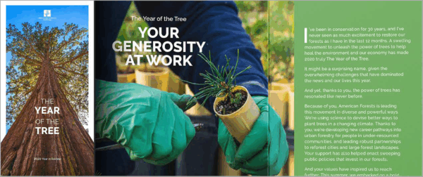
American Forests’ Annual Report: Notice how the trunk expands outside of the frame, which hints at the tree being a piece of artwork. The angle of the photograph makes it feel like it’s tangibly moving toward us, the reader. The tree – and nature’s beauty – is the focus. This cover illustrates what we call visual-verbal synergy; the image is in harmony with the title and type. Note too how small the logo is; logos are meant to tell you who the publication is from, while the intent of the cover is to make sure you pick it up. A giant logo is not as compelling as a tree, right?
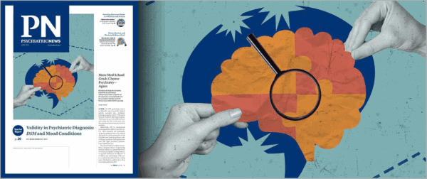
Psychiatric News Redesign (American Psychiatric Association): One of the goals of this project was to make it clearer that each cover featured two stories – a special report inside, and a cover story that launched right on the front. We wanted to present both in a way that looked less cluttered even though there was more content. We also changed elements to make it more oriented toward digital than print – the previous design had volume number, for example – and added social media icons to make the transition to digital more seamless.
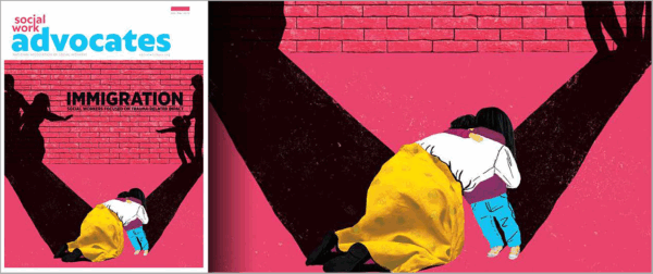
Social Work Advocates Redesign (National Association of Social Workers): This audience works on serious issues, and we can’t shy away from that. The reality of the human condition is an evergreen topic, and this cover – focusing on separation of families at the border – conveys extreme emotion. It’s powerful, with color and shadowing. Even the woman’s textured skirt, which looks real enough to touch, makes the image tangible and relatable.
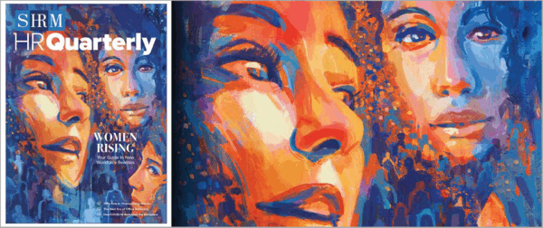
HR Quarterly Cover Illustration (Society for Human Resource Management): This cover is all about women’s empowerment. We went for a theme of abstract strength, with the outline of heads and shoulders along the bottom helping illustrate the visual synergy of women rising. It’s a cover that sticks with you because it’s so different from what one would expect from a publication cover.
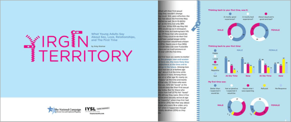
Virgin Territory Infographic Report (Power to Decide): This one relies on humor, with the zippers conveying those first explorations of sexual relationships. It’s clever, and it can bring what could be very statistical-oriented content feel more compelling, interesting, and factual without being boringly serious.
While each of these covers vary significantly from one another, they all started at the same place: the realization from someone in the organization that it was time for an update, which led to discovery sessions, goal-setting, questions and answers to learn more about the mission, collaborative designing, and presenting and tweaking to make a just-right, customized solution for our clients.
How can you as a client help us arrive at your next great cover?
“One of the first questions everyone should ask themselves,” Davies shared, “is to look at a typical publication cover at your organization and ask if it inspires you to grab that issue and see what’s inside. If it doesn’t feel intentional or inspiring, it’s probably time. We need the human spirit and the soul of an organization to seep through the design, or your publication won’t get noticed.”
To prepare for those early discovery meetings, think about your audience – both who it is now and who you want it to be. What works for you currently, and what doesn’t? Will you be changing platforms in the future? GRAPHEK also guides clients through a process designed to reveal goals and preferences, along with a lot of shared sample covers and layouts to discover what appeals to you and what doesn’t. Come open-minded and ready to just roll with it!
“I felt apprehensive about the whole process,” Parrish remembered. “But GRAPHEK is friendly, professional, and easy to work with. After the first round of cover designs, we actually struggled to pick just one, because they all hit the mark. The GRAPHEK team is open to change and took our feedback really well. I’ve had experiences in the past where designers have dug in on something and got defensive about a requested change; GRAPHEK isn’t like that. I didn’t want to work with a company that has great design skills but are impossible to work with – I wanted a company that has great design skills and is great to work with.”
Ready to up your cover design game or need to refresh a publication? Reach out and let’s talk about how your organization can make a bigger impact.