Font styles are perhaps something you think you don’t spend a lot of time really noticing – after all, we don’t want fonts to interfere with or encumber readability, and we certainly don’t want them to distract or make letters and words illegible. But to find a font that readers won’t overly notice? Well, that takes an enormous amount of effort and thought!
At the end of some books, for example, there’s often a very detailed description of the font style used, illustrating how much thought went into its selection. Publisher HarperCollins has tweaked specific fonts to save paper while retaining readability, all with the goal of no one noticing:
“The goal is to make these changes without the reader even seeing the difference,” said Tracey Menzies, the publishing company’s VP of creative operations and production.
Is it true, though, that we can appreciate fonts without really noticing them? We think so. When asked, most of us could name our favorite fonts, and we could immediately identify the circa 1932 Times New Roman as one of the oldest and most “original” default font. Many of us have been told somewhere along the way that serif fonts (those with the tiny lines or “feet” that extend off of the letters) work better for print, while sans serif (Latin for “without” and do not feature these small lines) work better for online readability. A lot of us recognize that some fonts seem overused and childish – we’re looking at you, Comic Sans! (Did you know that Comic Sans is met with such derision, it even has a site dedicated to mocking “comic sans criminals,” complete with a pledge to never use the font?!)
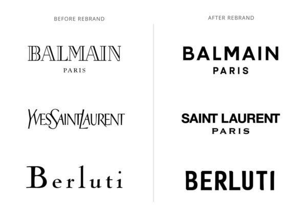
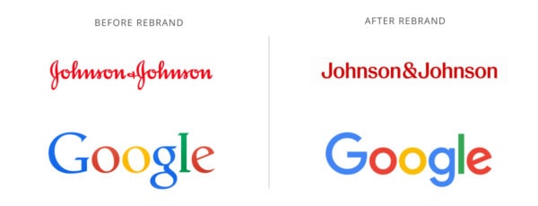
All this said, we’re going to encourage all of our readers to look at and really see all the printed and online text around you. What you’ll probably notice is what sometimes feels like the complete abandonment of serif fonts. Called “sans-serification” — a word coined by the poet e.e. cummings as he looked forward to printed text becoming more simplified – it’s led to modern brands moving toward minimalism and organizations worldwide adopting sans serif fonts for everything from convention collateral to publications to websites.
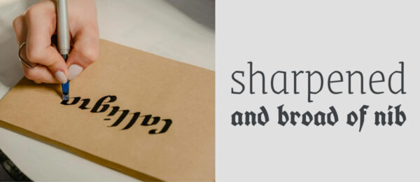
To understand how we got here, it’s helpful to take a quick look backwards: Fonts were originally designed to replicate hand lettering, since before the printing press was invented, all text – from stone monuments to religious texts – were written with a human hand. It makes sense that some of these wonderful peculiarities, like the thicks and thins created by a hand moving this way and that with ink in the tip of a bird’s feather, would make its way into the lead type of Guttenburg’s press.
But in the mid-20th century, design and architecture moved toward standardization, modular systems, and clean geometric shapes. One famous font that came out of this era was Helvetica. The Swiss designer, Max Miedinger, wanted a neutral font, and it became popular for the very reason we opened with: The importance should be in what the text is saying – the text itself should not distract through its own personality.
When computers were introduced, Helvetica was licensed to major companies like Apple, while the font Arial was developed so that Microsoft could display documents that used Helvetica without having to pay for a license. Sans serif fonts were also practical for the burgeoning digital age; their simplicity worked better for older monitors with a much more limited set of pixels and computers with limited memory. A greater number of sans serif fonts have also been credited with having slightly higher readability than serif fonts, thanks to their block-like, less decorative structures.
But in 2024, has it gone too far? We at GRAPHEK think so, as we fear brands risk losing more than they gain with this continued leap to sans serif. Many more fonts of both types are more accessible today, for example, and screens have become far more sophisticated. We have more widely accepted options for adding “personality” to any font style – using all-lowercase lettering, for example, lends a whimsical, friendly tone to any text.
“Most detrimental, in my view, is that logos are losing their personalities through this sans-serification trend, and the mass shift to sans serif feels antithetical to what a logo should be doing,” said Christina Davies, GRAPHEK’s art director & brand strategist. “As companies grow, I understand that they need to appeal to broader audiences – and what better way to ensure mass appeal than the beautiful neutrality of a standard sans serif typeface? Still, I think companies and organizations are doing themselves a disservice by defaulting to sans serif. Font choices can reflect the personality of a brand, but if every logo starts to look the same, what’s the point of having a logo to differentiate yourself from others to begin with?”
It’s a fair question, and as more of our clients request sans serif fonts upfront or are moving away from serifs completely, we’re urging clients to give serif fonts another look. Or, as the American Association of Endodontists (AAE) regularly – and successfully! – does, consider meshing sans serif and serif fonts together.
AAE relies on Cambria and Helvetica as their core serif and sans serif fonts, respectively, and they regularly experiment with other options – such as Rockwell, Lato, Raleway, and Calistoga – for their annual meetings, which have complementary but separate brand guidelines.
“We toe the line between using fonts that are closely aligned with our core fonts while adding others for flair and to make our materials look more visually interesting,” explained Natalie Hughes, AAE’s integrated marketing manager. “We often reserve fonts like Calistoga for calls to action or deadline-driven headlines, as it catches attention and stands out from our regular meeting branding. Social media graphics, which are most likely to be patient-facing, are also a place we’re willing to get a little funky with fonts like Shrikhand.”
This kind of staff-driven openness to exploring additional fonts is one we find unique and invigorating, and we’re encouraging all of our client partners to embrace it. Mixing and meshing fonts gives organizations a way to inject interest while staying true to their brand guidelines. But just as with the selection of any one font, nothing about such exploration is random: AAE, for example, gravitates toward fonts with rounded, softened edges, which complements their circle-based core logo font.
“Our last rebrand was almost 10 years ago,” added Hughes, “and GRAPHEK conducted a visual audit that opened our eyes to how much variety we’ve adopted over the last few years. It’s made us think more clearly about why we’re using various fonts – as well as how to use them more impactfully. So much has changed since our last rebrand – particularly with social media, which has provided a whole new landscape of options and how we consume information. We like having the leeway to play around with fonts, as it gives us a subtle and fresh way to surprise and delight without overhauling our core brand that our members know and recognize.”