Project Overview
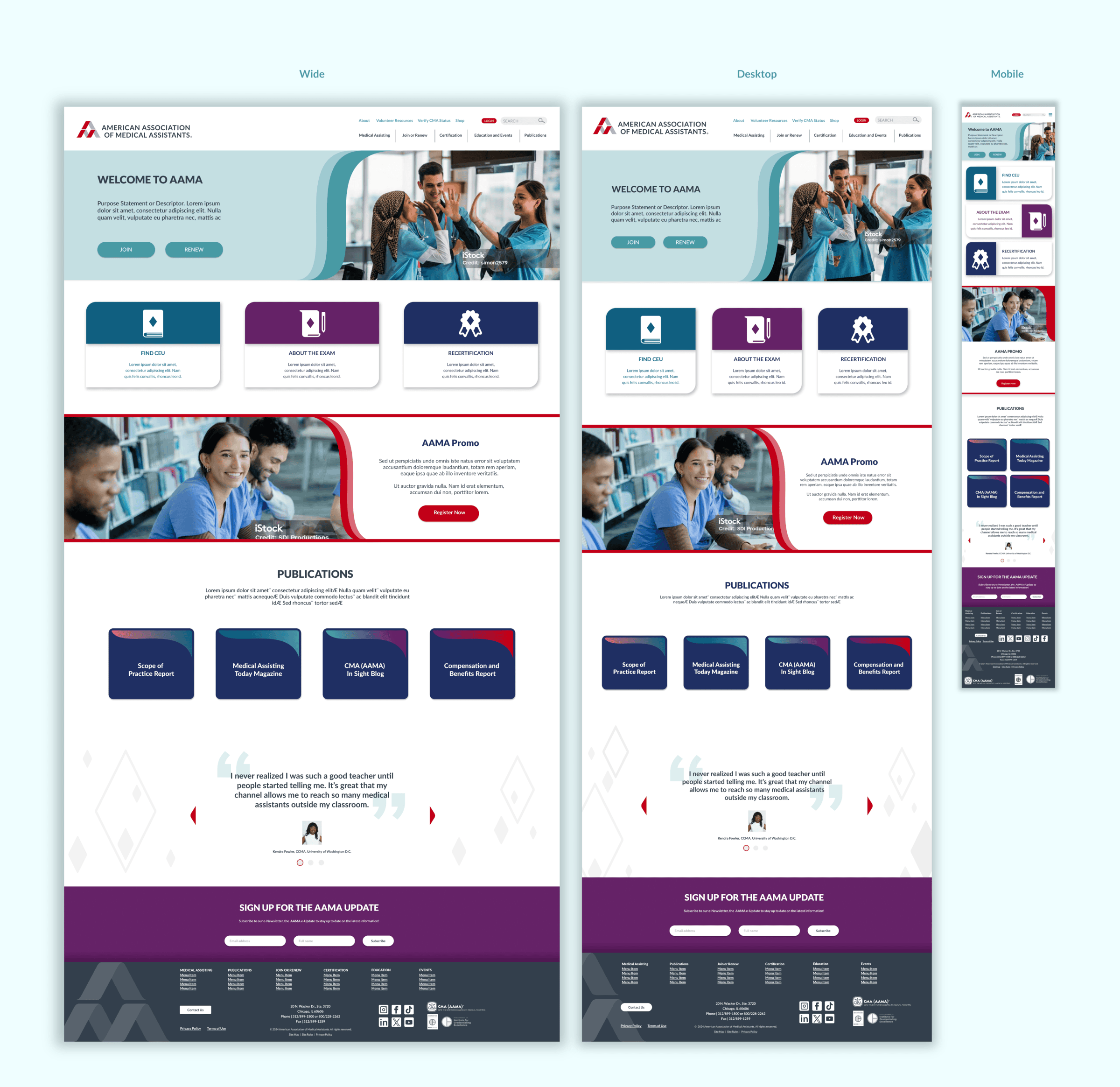
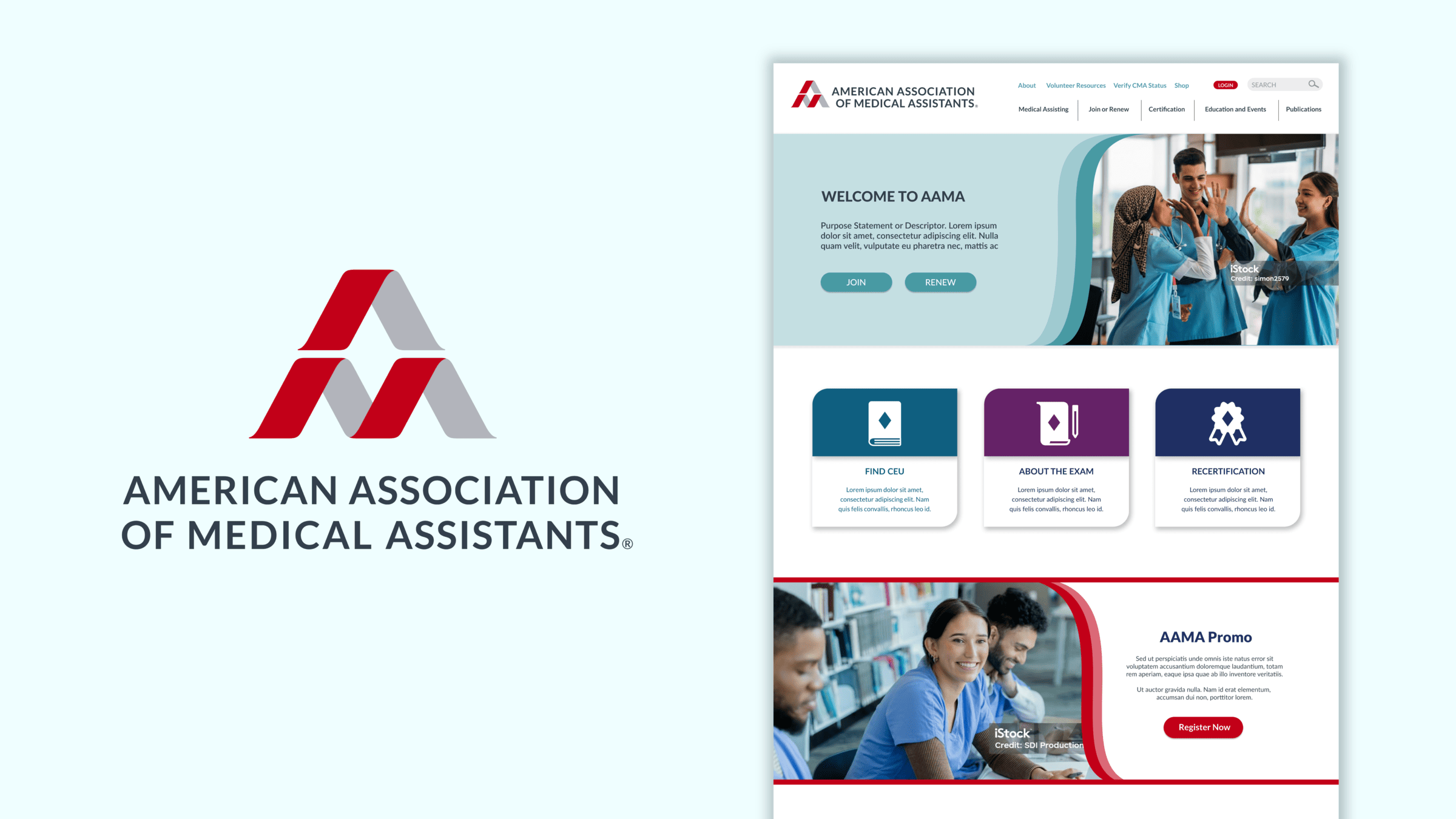
GRAPHEK partnered with AAMA to refresh their logo and conduct an overhaul to their website. After researching different user interfaces and talking to AAMA about the challenges they have been facing with their existing site, GRAPHEK created a contemporary visual system that reflected their aspirations and goals while maintaining the core of who they are as an organization: Approachable, warm, and human.
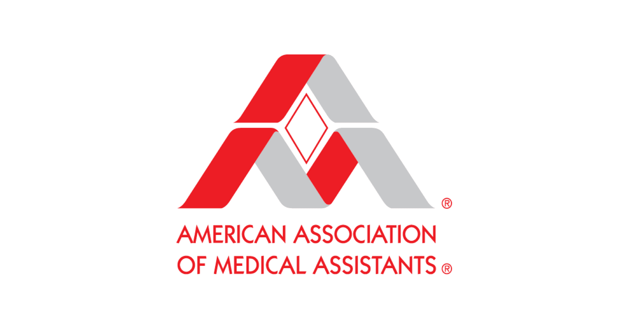
BEFORE
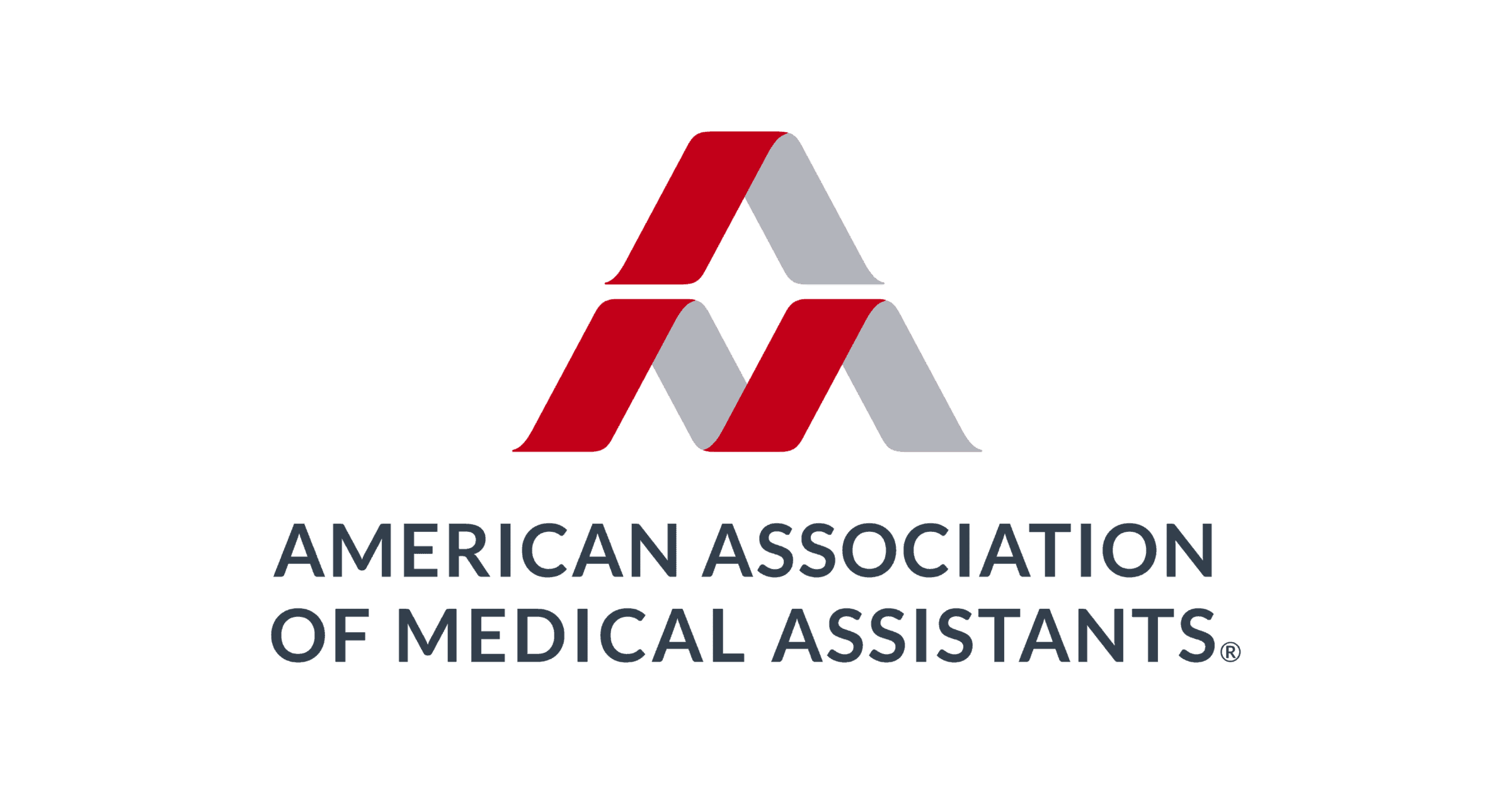
AFTER
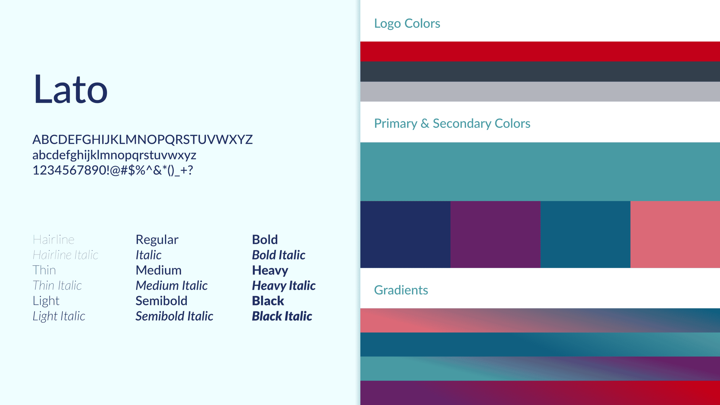
Initial research, exploration, and brand review revealed the strong brand equity associated with AAMA’s original logo and a clear desire to preserve its recognizable form. In response, GRAPHEK modernized the mark while remaining true to its core design. The color palette also pays homage to the original, with deeper, more refined tones that minimize visual vibration and allow for a broader range of complementary secondary colors.
GRAPHEK modernized the overall look and feel of the AAMA website while addressing key pain points expressed by the AAMA team. We delivered mockups for a primary landing page and two secondary pages, each showcasing a range of stylistic elements to guide the development of the full site. To ensure a seamless user experience across devices, GRAPHEK also provided both wide and mobile versions of the mockups, demonstrating how key elements should scale and adapt to various screen sizes. The final deliverables successfully balanced visual appeal with functionality, setting a strong foundation for the future of AAMA’s digital presence.
