Sharing a connection with a beloved brand can feel deeply personal and intimate – think, for example, how strongly “Coke vs Pepsi” lovers will defend their favorite cola, or how nostalgically upset many of us were when Klondike announced it was discontinuing the Choco Taco ice cream novelty.
Enjoying that kind of loyalty with an audience is the result of making connections, which are formed when an organization knows with certainty who it is they’re trying to reach, and when individuals are attracted to a brand’s voice, personality and promise. Design can contribute in a big way: Effective design carries meaning and feels relatable, is impossible to ignore, and leaves an impression. Smart visuals can help draw attention to particularly important written content, as well as help translate difficult concepts and increase the likelihood the information will be processed and remembered.
But like most things, design is affected by shifting trends. How can an organization balance the need to stay true to an established brand while staying fresh? At GRAPHEK, we’re big believers in helping our clients be on trend rather than trendy. For us, that means staying true to your audience and honoring your brand over the long term, but capturing shorter term opportunities to embrace modern, fresh trends. An association’s annual meeting, for example, might be a time to make a splash with playful collateral and themes, while an annual report may need to stick more closely to the tradition of a brand.
To help shed light on the importance of connecting through design and effectively reaching an audience, we sat down with John Wehmann, director of design at the Urban Institute. A longtime partner, the Urban Institute frequently uses graphics to tell its story, and we’ve been honored to create custom designs for them over the years.
“We are a research-heavy organization, working to guide policy with changemakers,” Wehmann explained. “We publish a lot of white papers, and, not surprisingly, people don’t want to read a 40-page document without a visual break. Sometimes, readers need inspiration and key takeaways, and we’ve looked at a lot of different ways to highlight important information through visual storytelling and make dense content more digestible through design. That can be a simple combination of text and images to help clarify and highlight the messaging, which for many people has the added benefit of encouraging better retention, or it can be translating stats into a visual to highlight key findings.”
One important element for organizations to consider when planning any kind of communications and marketing collateral is the importance of engaging writers, designers, and other contributors from the start, to ensure everyone on the team can share in the intended vision from the beginning. Oftentimes, part of the team is airdropped in midstream, making it much more difficult to capture the most important priorities and messages. What might seem the most salient points to one team may seem the least important to another!
Branding, style, and design guidelines can also play an important role – especially as we consider changing trends.
“Our design guidelines are very set, so we can’t push too far,” Wehmann added. “But when we think about visual content, I think we have the responsibility to not rely so strongly on the same iconography that we are unable to reach a wider audience. We need to be vigilant in terms of representation and making sure our designs resonate with people of varied backgrounds. If you want your audience to grow, your guidelines need to be flexible enough to allow for growth in design and branding.
“We’re definitely seeing a trend toward realism,” he said. “That may mean recognizing, for example, that people are struggling or feeling marginalized. We don’t want to be overly ‘doom and gloom,’ but we strive to show a cross section of the cultures, communities, and people we’re representing, whether via photography, illustration, or even iconography.”
Wehmann is also noticing more designers adding personal touches to their work, breaking the “rules” ever so slightly by adding an illustrative element or even some hand-drawn work to an otherwise very on-brand design. Even the smallest detail can add texture, humanism, and a personal touch, ultimately making communications or marketing collateral that much more relatable.
“An important change I’ve recently noticed,” he added, “is less siloing and separation between the design disciplines, which I find so refreshing. I don’t hear much of the ‘I only do logos’ anymore; we’re all exploring new tools and processes more, and that’s driving new trends and new movements in design. I love seeing the flash that results when people bring their own personal style to their work. We all benefit from it, as organizations and people connect more easily and memorably. That’s what advances the kind of brand loyalty so many organizations are seeking.”
From GRAPHEK’s Seat:
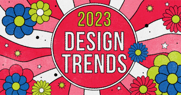
What Trends are we Seeing?
What trends are we noticing? Regardless of how an organization feels about a particular style, it’s good to be aware of what’s out there. Here’s a compilation of trends we’re noticing.
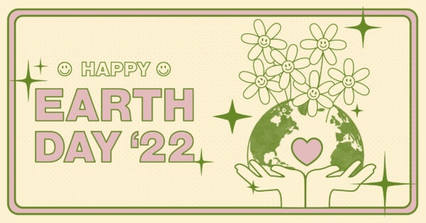
1970s Flat Design
In a post-COVID world, people are looking for something that is bright and uplifting; these examples are, in the designer’s words, an effort to convey “a colourful retro-inspired World’s Fair identity that was welcoming and playful.”
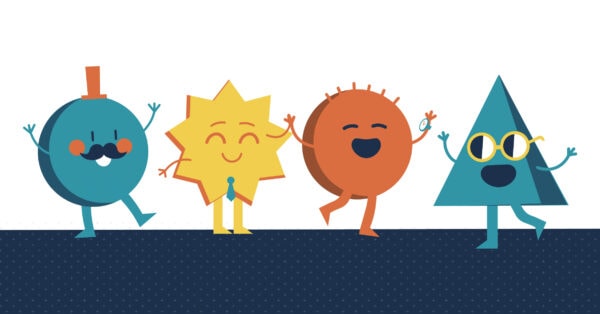
Personification / Personified Objects
Designers and audiences want to have fun, especially as people look for joy and humor after several years of turbulence and uncertainty. In the world of graphic illustration, there’s a growing trend of playfully personifying objects, often with classic cartoon-gloved hands as a nod to classic cartoon characters, but sometimes even with a simple smiley face.
Maximalism
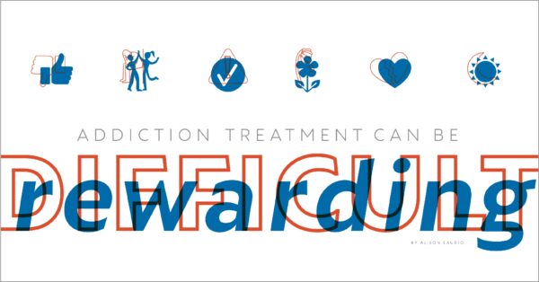
Considered a great choice for fun and youthful brands, you’ll see bold typography and colors, overwhelming elements, multiple fonts, saturated hues, and very little negative space. It’s meant to be striking and unforgettable – a total “visual overload.”
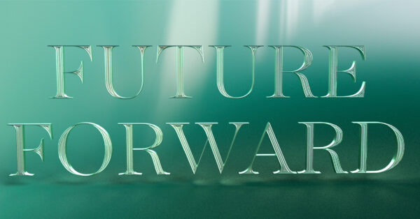
Dimensional Type
In line with maximalism, this artificial intelligence (AI)-generated style feels futuristic and leans into a metaverse on the horizon and 3D-printing technology. It’s hyper-realistic and immersive, lending itself well for a very engaging look.
Printed Techniques
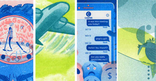
The physicality of marketing collateral can be as impactful as the design itself, so just as many music aficionados are returning to vinyl records, printing has also seen a resurgence, particularly as a screen-weary population has gained renewed appreciation for the touch and feel of a hand-held, tactile piece. We’ve seen an increase in the use of risograph, silk screen, and even photocopy effects, even for exclusively digital applications, for a hand-done, low-tech feel. Sites like YouWorkforThem.com, where designers can shop for fonts and graphics, also provide tools and software to make it even easier to create convincing print effects. We don’t think this trend is coincidental; it’s happening alongside a shift toward looking to the past as our world feels turbulent and unsettled, and as realities like supply chain disruptions and rising costs have made a “back to basics” approach a necessity for many.
Typographic Solutions
Similarly, designers are using dynamic typographic solutions, combined with the messaging, to help make an impact. The range of fonts and type available is soaring as more organizations depend on type to help communicate their vibe.